|
|
Post by illmatic94 on Feb 6, 2009 3:54:22 GMT
|
|
|
|
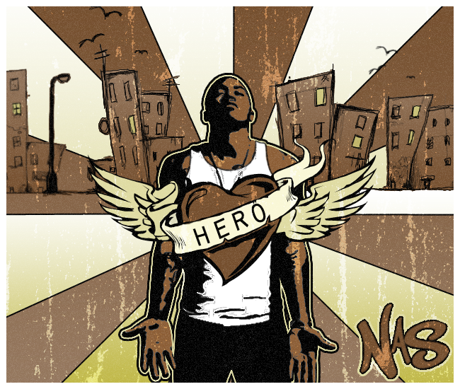
Post by Hybrid Zero // on Feb 6, 2009 18:54:19 GMT
You're really fricken' talented. Lemme just say that straight up. The second one is my favorite just because it's got a great amount of color in it.
Keep it up; these designs are awesome.
|
|
|
|
Post by ishmael on Feb 8, 2009 19:53:05 GMT
i would like to see these full size. right now they are all really low quality, and i'd like to see them correctly before i make any judgements. if this is how they are supposed to be, then all of them are low quality, and you'd have to fix that. last one is the best, you nailed the style.
first is uninteresting. you make the focal point a spray can... tak eout the entire left part, and show me just the graffiti, that is must more interesting.
the 2nd one is alright, but like i said, its low quality, and background is bland. bring the red and blue strip farther down left, that should solve the problem. make your vector object larger as well.
last one, just bring it to its normal size, that should get rid of that nasty pixellation. if you did that on purpose, i apologize, but the left building is really soft and smudgy, whereas everythign else is sharp and pixelly, for example, the text.
|
|