|
|
Post by .t.w.i.l.i.g.h.t. on Jan 7, 2008 5:33:49 GMT
ONE OPPONENT ONLY!!!Simple, make a signature using an Assassins Creed image, based around Assassins Creed, or has anything to do with the game. For instance, I will probably use and Altair image with a name that isnt Altair. Whoopdefuggindooo! First to four.TURN IT IN QUICK YOU BOOGIES... IM HYPHY ONE ONE I AM WORKIN ON!!!Tao Ren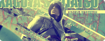 DishwasherSafe DishwasherSafe
|
|
|
|
Post by cypher on Jan 7, 2008 6:35:17 GMT
Alright I have a crappy 10 min image I can submit
|
|
|
|
Post by .t.w.i.l.i.g.h.t. on Jan 8, 2008 3:39:39 GMT
2 minutes a day?
|
|
|
|
Post by cypher on Jan 8, 2008 4:18:56 GMT
no no, its done. I'm just waiting.
|
|
|
|
Post by .t.w.i.l.i.g.h.t. on Jan 8, 2008 4:51:43 GMT
Mine is ready.
Posting it now.
|
|
|
|
Post by cypher on Jan 8, 2008 9:06:05 GMT
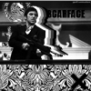
o_0 Pretty Tao. Whats the voting too? |
|
|
|
Post by .t.w.i.l.i.g.h.t. on Jan 8, 2008 22:10:16 GMT
four
|
|
conquest.
Full Member
 for glore; evermore?
Posts: 133
|
Post by conquest. on Jan 8, 2008 22:14:27 GMT
My vote is for Tao. The typography is great, and Kaguya are ftw. The depth is good, and I like the bars that cross infront of the stock, adds more to the overall appeal, imo. The lighting is pretty good, also. I do think the back is a little overblurred, but not enough so to subtract from the overall appeal.
Good job, both of you.
|
|
|
|
Post by Ryan on Jan 9, 2008 20:56:57 GMT
Tao: I like the bars, and the text. The colors work perfectly here. It doesn't look "flat" and the image is very well-balanced. I think it could flow a little better, seems to be a little all over the place. Dish: I like yours. The stock is well done, but the boring gradient takes a lot away from the image. I think the text is also a little too overpowering. Vote: Tao Tao: 2 Dish: 0  Good job both of you! |
|
|
|
Post by jongos on Jan 10, 2008 0:43:54 GMT
When I looked at this, I immediatly though Tao Ren. However when i examined them more closesly i changed my mind.
Vote: DishwaterSafe
Tao Ren: I like the lighting, but that's about it that really stands outto me here. The text is also interesting, but there isn't really that much going on, some cut up stocks, but not that much.
DishwaterSafe: I'm not too fond of this either, the background brushing is nice, but i think you shouldn't ahve allowed so much white space. the text is also a little big.
|
|
|
|
Post by .t.w.i.l.i.g.h.t. on Jan 10, 2008 2:43:14 GMT
Not to bitch, but it seems like you are contradicting your own statement, if someone were to read your descriptions of what you though, you didnt like a single piece of DS's, but yet you voted.
2-1 favoring TR
|
|
|
|
Post by jongos on Jan 10, 2008 20:33:37 GMT
|
|
|
|
Post by Kay on Jan 16, 2008 3:47:43 GMT
Tony; simply amazing. I love camouflage so this sig really grabs my attention, seeing as it looks quite like it. The render is used well, blending is nice. The use of text, and the effect is wonderful. Good placing. Colors are perfect.
DS; Too much white space. >_< My main complaint, use a bigger render instead of bigger text. Or make the sig size smaller. The background image at the bottom fading into one color (going towards the top) is nice though. I will say the red against the blue is rather distracting.
Vote: Tony
Tony: 3
DS: 1
|
|
|
|
Post by SilverWings [Birdie] on Jan 20, 2008 6:15:32 GMT
Tao Ren- This is excellent, as I see more and more of your work I see how much I really like it. You style is excellent, and you use the image to your advantage. And the colors you used really add something more to it. Very nice.
Dishwasher Safe- I like this, but like many others said, there is so much white. And I am not sure how I feel about the red, seems out of place. I feel your text takes away from your image. Good job though.
Vote: Tao
|
|
|
|
Post by cypher on Jan 20, 2008 7:37:44 GMT
Congrats Tao... someone finally beat me.  |
|