|
|
Post by jongos on Jan 7, 2008 0:14:49 GMT
theme: music jongos:  LPF: 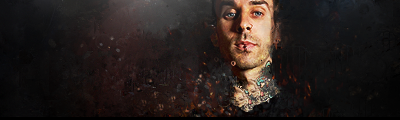 votes to four. gl. |
|
|
|
Post by TROWLIN' on Jan 7, 2008 0:32:32 GMT
if i can find a stock i'll do it
but if anyone else finishes before me go ahead and enter it
|
|
|
|
Post by jongos on Jan 7, 2008 0:49:10 GMT
okay.
|
|
|
|
Post by TROWLIN' on Jan 7, 2008 1:00:42 GMT
|
|
|
|
Post by jongos on Jan 7, 2008 1:20:39 GMT
|
|
|
|
Post by Ryan on Jan 7, 2008 2:55:59 GMT
(I know this is in the wrong board for voting, but bite me.  ) jongos: There isn't a whole lot going on here. Just some simple blending, but you did a good job. It looks good, but I think you could have done more with it. For some improvments, I would try to work with the contrast a little. Good job. lpeef: I like this a lot. It is a little dark, but it fits in well with the stock. I like the different effects here. Though the right and left look a little too empty, I would try and fill them up a little bit. On the right side of the stock the contrast seems a little off. Maybe it is just me, but I like it. My vote: LPF. |
|
|
|
Post by xavier on Jan 7, 2008 19:25:02 GMT
LPF: This one is too dark. It could use some text on the right side to fill up some of the empty space. I like the stock you used and the effect you created around the stock, but overall the something about it I don't like. jongos: No text either? What's going on  I like the colors used, the color in the top left looks good but it doesn't stand out enough. I think it would look better with the texture's opacity reduced so the background colors would stand out a bit more. I do like it though. My Vote - jongosLPF: 1 jongos : 1 |
|
|
|
Post by TROWLIN' on Jan 7, 2008 20:57:05 GMT
It's usually rare to see text in sigs these days because text is usually the component that brings the sig down the most. Don't be surprised when you dont see it. |
|
|
|
Post by Ryan on Jan 7, 2008 21:21:17 GMT
It's usually rare to see text in sigs these days because text is usually the component that brings the sig down the most. Don't be surprised when you dont see it. But good text helps out soo much. |
|
|
|
Post by TROWLIN' on Jan 7, 2008 21:35:37 GMT
everyone sucks at text though which is a problem. |
|
|
|
Post by xavier on Jan 7, 2008 22:27:53 GMT
It's usually rare to see text in sigs these days because text is usually the component that brings the sig down the most. Couldn't disagree more, if it's done well it makes the sig look a lot better, and it can 'complete' the sig. |
|
|
|
Post by TROWLIN' on Jan 7, 2008 22:40:48 GMT
...but it's rarely done well, hence why they dont do it.
I never said it couldn't be done well, I just said it's rare to see text because not very many people can pull it off. Among proboarders anyways.
|
|
|
|
Post by pandora on Jan 7, 2008 22:51:27 GMT
You are both pretty much saying the same thing. Some avoid that which they can't do as well as they want, and some do it more often to get better. Being very good at text should be a status symbol then, yes? Just babbling... My vote: AdamJongos' looks like it has a lot of glare that is very distracting. Adam, yours looks AMAZING on a black background, but it still translates well here on a light background. Well done. This is the best I've seen from you lately. It makes me happy. Colors, no text, and I actually see the tattoos on his neck before I even look at his face. It really draws my attention.  LPF: 2 Jongos: 1 And Ryan, I refuse to bite you for voting early. |
|
conquest.
Full Member
 for glore; evermore?
Posts: 133
|
Post by conquest. on Jan 11, 2008 4:22:21 GMT
Adam.
Jongos has a nice piece, and the colors are pretty interesting, but I'm just not a fan of the various effects, mostly those that overlap the focal, which I think could stand out a bit more.
I like the effects Adam used, and the detail and depth; I'm not a fan of the black BGs, this one in particular: it gives the illusion of a floating head. It's good, nonetheless, and the better of the two, imo.
Adam: 3
Jongos: 1
|
|
|
|
Post by Kay on Jan 16, 2008 3:39:46 GMT
jongos; although I love the use of the colors, smoothness, and overall appeal, I don't like how texture is over the render. Making that slick would've probably made it pop out even more. Contrast could be used to be messed with.
adam; it looks simply amazing on a black background. There's specks of white and little bit of color here and there. Although I love color, I love black as well. The render isn't centered like it typically is, and the effects are used rather well. No text actually spoke more words than text itself would've.
Vote: Adam.
Adam: 4
jongos: 1
Congrats on the win, adam.
You both did great.
|
|


 )
) I like the colors used, the color in the top left looks good but it doesn't stand out enough. I think it would look better with the texture's opacity reduced so the background colors would stand out a bit more. I do like it though.