|
|
Post by .t.w.i.l.i.g.h.t. on Jan 4, 2008 6:14:46 GMT
ONE VICTIM!Open size within signature bounds, any color, theme, programs. Nothing done over a week ago. First to 3 votes!Tao Ren adamisonfire adamisonfire
|
|
|
|
Post by Pritchard [Epic][Girly Boy] on Jan 4, 2008 7:57:54 GMT
I'm in.
|
|
|
|
Post by .t.w.i.l.i.g.h.t. on Jan 5, 2008 7:58:48 GMT
Submit Ronald McDonald!
|
|
|
|
Post by Pritchard [Epic][Girly Boy] on Jan 6, 2008 0:05:40 GMT
?
Ok...
Can I start on Monday?
I'm staying in hotel with 3 buddies, and about 7 of my siblings. We're in northeastern Ohio, and I don't have any stocks or anything to my availability. i could have it in by Wednesday.
|
|
|
|
Post by .t.w.i.l.i.g.h.t. on Jan 6, 2008 1:46:12 GMT
Thats like, over this weekend. We can battle when you get back...
STILL LOOKING FOR VICTIM!
|
|
|
|
Post by TROWLIN' on Jan 6, 2008 19:25:34 GMT
|
|
|
|
Post by jongos on Jan 6, 2008 23:32:45 GMT
vote: TR
lpf's was too dark. Also, I liked the text on TR's.
By the way, osgood> dom. =P
|
|
|
|
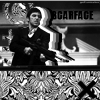
Post by TROWLIN' on Jan 7, 2008 0:04:35 GMT
figures that i just made a sig 100 times better than that one just as dark though! if it looks too dark click the blackbg link, it looks better there.  anddd... if there was a picture like that with osgood i'd have used it. |
|
|
|
Post by Ryan on Jan 7, 2008 3:02:15 GMT
Tao: I like the stock.  I think you did a good job with your placement, and I think it flows well. I really like it, but I would try and add some more color depth. It's all kinda light how it is. The text is great and the curved edges really work well. Good job! LPF: I like the stock, xD. The color is good, I don't think it is too dark at all. I like the bar on the bottom. You did really well with the text on this one, good job. The contrast on parts of the shirts are off a little, but other than that, I think you did really well with this. My vote would have to go to LPF.  Keep it up, both of you. |
|
|
|
Post by xavier on Jan 7, 2008 19:09:04 GMT
Tao Ren: Nice colors, nice light colors, maybe a little too light. The curved edges look good and the text so does the text, but the bar on the left side looks out of place. LPF: It's not to dark, it's fine. Good overall color, a nice tone of dark red running through the sig. The text stand outs but also fits in with the rest of the sig because of the color. Good job both of you  My Vote - LPFLPF - 2 Tao Ren - 1 |
|
|
|
Post by pandora on Jan 7, 2008 23:02:26 GMT
I'm going to surprise myself and vote for LPF.
Tao, you are an excellent sig maker and probably the most skilled at text on sigs, but this wasn't my favorite by you. Nice rack, though.
Adam, your colors are perfect, in my eyes. Great job. You really have been inspired lately.
Adam Wins! Congratulations!!!
|
|
|
|
Post by .t.w.i.l.i.g.h.t. on Jan 8, 2008 23:35:47 GMT
I hate SSD.
I hate LPF.
I hate pandy.
|
|
|
|
Post by pandora on Jan 9, 2008 1:48:46 GMT
 Love you too.
|
|


 I think you did a good job with your placement, and I think it flows well. I really like it, but I would try and add some more color depth. It's all kinda light how it is. The text is great and the curved edges really work well. Good job!


 Love you too.