|
|
Post by cypher on Nov 19, 2007 21:41:06 GMT
Theme: Open (emphasis on text placement and or typography) Style: Open Size: Any Colors: Any Stock Images: Allowed 3D Renders: Allowed Text: Required Animation: Allowed -- I need work on my text work and would like to get a battle in to help me. Only one person shall come forward.
Entries DishSadiraNoxFirst to four votes |
|
|
|
Post by sadira on Nov 20, 2007 6:48:16 GMT
I'm In.
I had an idea today that I want to see if I can bring to fruition.
|
|
|
|
Post by cypher on Nov 20, 2007 7:41:27 GMT
Okay then, The battle is set. Two weeks from now entries will be due. Feel free to submit early if you wish. I will try to submit before two weeks but I just want to be safe.
GL & HF
|
|
|
|
Post by sadira on Nov 21, 2007 7:31:19 GMT
Ok. I know its WAY early, but I really wanted to see if I could get what was in my head out onto the screen. I think I came pretty close, and I'm quite happy with it. Since you mentioned text work, I decided to go with lyrics to some of the Nickelback songs that mean the most to me, or I just plain love more than some of their others. The background was done by me throwing some random brush shapes in different colors on the base background, then adding a filter *gah I can't remember which one* and that was one of 2 total filters I used. The other filter is a diffuse glow on the argile pattern on the background layers. I used blur, burn, and smudge tools on the background, a transparent color overlay, and a few other things. The rest was just shapes and then getting the text right was a B*itch. I wanted to practice using the perspective feature, so this was a good practice for me with that. Nickelback stock image/logo copyright to the Nickelback website/band.GL & HF yourself!  [edit] I hate it when I click the wrong link on photobucket.  |
|
|
|
Post by ησχєs on Nov 21, 2007 17:56:49 GMT
Can this go 3 ways? I wonder?
|
|
|
|
Post by sadira on Nov 22, 2007 1:35:29 GMT
I don't really care, but its not up to me.
|
|
|
|
Post by ησχєs on Nov 22, 2007 1:37:07 GMT
Dishy?
|
|
|
|
Post by sadira on Nov 22, 2007 3:32:50 GMT
nox, if not, i'll post a battle.
|
|
|
|
Post by cypher on Nov 22, 2007 4:52:45 GMT
Nox, since I still need time I will allow it.
No more people
|
|
|
|
Post by ησχєs on Nov 22, 2007 23:07:17 GMT
Yeah!!! So lemme see this is an old piece, I've been dying to use. CLICK HERE!!! |
|
|
|
Post by cypher on Dec 8, 2007 9:21:18 GMT
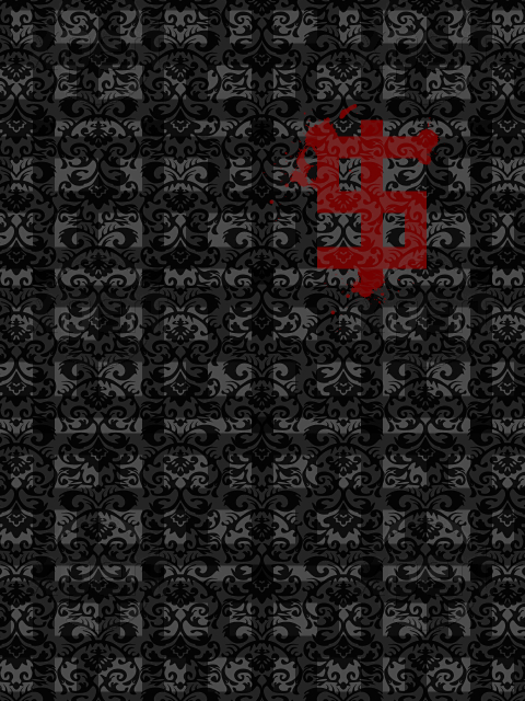 Sorry I was late guys. Heres my typography piece. |
|
|
|
Post by ησχєs on Dec 15, 2007 2:38:12 GMT
:/ So..... We all are done? Edit first post.
|
|
|
|
Post by sadira on Dec 24, 2007 6:54:00 GMT
I think he forgot about this thread ...
|
|
|
|
Post by TROWLIN' on Dec 24, 2007 20:34:34 GMT
woohoo for no battle board mod
|
|
|
|
Post by cypher on Dec 25, 2007 23:01:41 GMT
I cant move the battle. I have to wait for the battle board mod to move the thread. I have moved my own before and was yelled at because it screws up the organization or something.
|
|
|
|
Post by sadira on Dec 26, 2007 6:21:00 GMT
Sorry Dishy ... for some reason I thought you WERE the mod.
but who is???
|
|
|
|
Post by TROWLIN' on Dec 26, 2007 6:39:18 GMT
nobody the mod stepped down  |
|
|
|
Post by pandora on Dec 26, 2007 12:51:12 GMT
Yes, he stepped down, and I've been too busy to notice the neglect of the poor wittle battle board.  Anyway, my vote goes to Dishy. His piece is very pleasing to me, and the placement so perfect. Sadira's is a little too busy with text for my taste. Nox's really stands out, and the text is subtle enough, but I just happened to like Dish's piece more. |
|
|
|
Post by Ryan on Jan 1, 2008 3:14:05 GMT
Dish, I like what you did with this. The placement and the concept is really good. I think you could have gone a little further with this, and added a little more color. Sadira, yours is really crazy with the text. I would try to cut back a little bit, and be a little more conservative.  Nox, yours is nice, but kind of bright. I think you should work on your contrast, My vote goes to Dish, his concept was the best IMO. Good job everyone! |
|
|
|
Post by xavier on Jan 2, 2008 1:52:27 GMT
Sadira: A lot of text, way to busy, sometimes less is more. I like the background but I think different colors would look better.
Dish: Interesting concept, it looks like wallpaper. I like it but I swear I've seen something very similar from you.
Nox: The contrast is fine maybe it's your monitor Ryan. I really like it, aptly titled, it's an explosion of color and colors that go well together. Nice subtle text plus good placement.
My vote - Nox
Dish - 2
Nox - 1
Sadira - 0
|
|


