nest!
Junior Member

Posts: 53
|
Post by nest! on Apr 17, 2007 4:02:04 GMT
SOTW 142A good show of entries this week, this week was definitely a defining moment of the phrase 'quality not quantity'. Well, I must say though I was quite impressed. It was a fairly easy theme, though once again I saw the same old designers working hard ... it's really time we find some more entrants. Though without further ado. here are the results ... ________________________________________ Please note that the following are in no particular order*conquest.To be honest, quite plain and dull. I appreciate the effort you've put into this signature, though the lack of color is very unappealing. For next time I would suggest working closer with flow. This signature seems very sporadic. The color choice was also quite poor. Good effort this week, I definitely look forward to seeing more of your work. cloudblazerI hate not being able to award you any more. The style and attention to detail was all their. Though there was something missing, your lacking a lot of overall appeal lately. I adore what you've done. Though overall it lacks contrast, and composition. It's a gorgeous signature, a solid effort this week. I look forward to seeing more signatures from you. Tao RenHehe, great signature, classic movie. Great taste this week. Your signature definitely has the potential to be a winner though up against this weeks contestants I wasn't that impressed to be honest. It's a gorgeous signature, I like your overlay effects and random nitpicky details. It's outstanding, great job. flux.exeohemgee, a new contestant. It's great to see work from you. You definitely have an eye for detail and outstanding work. I really like this signature, the border definitely works wonders. Next time I would suggest adding a little more color, for flair and style reasons. Everything is great, though it just needs some fine tuning. mondo66S-E-X-Y ... should I say any more? I really like this. It's a very lively and vivid signature that really is out there. The one detail that put me off was the size of this signature ... it's just to big for my taste. Overall a great signature though ... fantastic job. seventyx7Soooo green. I love this signature, I love how vivid it is. It's just looks so real, to be honest I have this burning desire to lick it. I really like the almost overpowering green. Though you haven't used to much. I really love it. I was torn between your signature and the winning signature for quite awhile. A solid entry, I truly love it. and now for the winner ...  Congratulations to Project 22329 on the winning signature. I must say a designer like Project, must know he's done something right when he makes the judge have a burning desire to watch Pirates of the Caribbean after viewing his signature. Honestly, I don't quite know how you do it. I adore this signature, there really is nothing much to say ... would an 'I love you' be enough? +SOTW Champion Custom Title Awarded (bother an admin or g-mod)  
|
|
nest!
Junior Member
Posts: 53
|
Post by nest! on Apr 25, 2007 0:40:46 GMT
SOTW 143Hehe, I am so very pleased with the outcome. It's been quite the week. It has been quite refreshing to see a lot of contestants to come out of their shells. A great show of art this week. Fantastic job. _____________________ Please note that the following is in no particular orderCloudblazerHehe! Daft Punk! I really like your style this week, very much the same sort of style you usually do though I really enjoyed the color and tenacity of this signature. One thing I would recommend for the future would be to add text. This signature to myself seemed to be lacking that little flair that text would usually give. Very good job nonetheless. conquest.Err ... I found this signature to be very dull and unappealing. The aura it gave off I adored though all in all it was very unappealing. The colors lacked and the sizing seemed a little warped to be honest. One positive aspect though is your text that was neatly tucked in, it was very appealing. Tao Ren-laughs- Nice signature, you chose a great image for this signature though I thought that you might have overdid yourself on the right side. I really adore your border its effective and does the job perfectly. Great signature! flux.exe Gorgeous signature, though I'm still struggling to see how this fits under a retro theme. Nonetheless a decent job, the border really worked and the angle of the image was spot on. Good job. Project #22329I honestly can say I expected more from you. This was a dazzling signature, though I was expecting something more lively and vibrant much like your previous signatures, I adore this signature though I expected much more. seventyx7#99! Perfect style and theme, I really like your signature, my one complaint is the text it didn't seem to fit. Also, like Project next time I would suggest to pick more appealing signature. Fantastic signature, though left a little to be desired. ... and the winner is  Congratulations to JzEx, on a gorgeous signature. I really appreciate this signature, your successfully incorporated the theme into a gorgeous vibrant, and very attractive signature. Kudos to you. I love seeing more work coming from you. Great job, you are now tied with Jonny for all time SOTW standings. [sotw-star][sotw-star][sotw-star][sotw-star][sotw-star][sotw-star][sotw-star][sotw-star][sotw-star] 
|
|
|
|
Post by urbancinderella on May 3, 2007 19:42:18 GMT
SOTW 144Hey guys, stepping in for David this week as he's going through an unplanned absence. He should be back next week: no fear. But for the time being... you'll have to deal with my judging. Mwaha.
Please note that these are just in the order I saw them.Also... please understand my comments are meant constructively just because a few of you seemed confused about what exactly constituted minimalism. conquestNice try for minimalism by choosing one figure and placing it simply... but just a note: generally, when you are using 2D and adding animated squares, you're stepping past minimalism and into a more technical, detailed theme. Nice sig overall though, just not quite fitting the theme. DudeIt is overall minimalistic, but in making it simple, you took away some of the interest. When you're going with a minimalistic image, you add interest through the layout. I personally wouldn't have centered the image; make the image interesting by playing with the placing and move it more to the left, leaving negative space on the left. That's the other key to minimalism: negative space. Also, the font isn't very minimalistic. Stick to a simple, clean font for minimalism. nicolasgayI like how smooth it is and it's definitely minimal, but to be honest: it needs something. Minimalism doesn't have to be bland and while your design is clean, it's not only too bright but it has no real color to it. Minimalism is about making your space count. There should be a lot of negative space - which your sig has - but where my eye is drawn should be a place of serious interest. I don't have anything that my eyes goes to here: give it some focus. (Also- center your highlight. It almost hits the edge on the right but isn't even close on the left.) Good job experimenting with typography though. ProjectGood example of minimalism. I like the bright colors and the use of negative space. My eye was immediately drawn to the flowers and pleased to go there. I'm not fond of the border, for some reason it makes me see your sig as more of a techno, 3-d Brandon-esque graphic... but I honestly don't know what else I would suggest for the image, so it works fine. Good job overall, I just still feel like it's missing something personally. MikelWhat program are you using? I like the concept, but clean up the layout. Set a focal point for your image; as it is, my eye just ends up trying to take it all in at once and getting a little confused. Also, I'm assuming your text is supposed to go "Save Lives, Give [image of blood]" which would have added interest if you had explored that typography a bit more. As it is, it's just sort of randomly spread around. Also, not sure this is minimalism: the cross breaks it up too much... maybe if you grouped the cross, the typography, and placed them on the right side like a nice logo with negative white space on the left... MitchLove the shapes and it's definitely minimalism, but something was lacking in the arrangement for me. I would have suggested placing some text in that little blank area between the second and the third drop. I don't know... something about it didn't come together in that small space, but I'm sure I would love the larger image. LPFNice colors, nice text effect and you've definitely gotten good with the arrangement of your signatures to add interest. Not sure I'd consider it minimalism though. It's clean, which is good, but it needs more negative space. Like the vectored shapes in the background; you have produced a nice signature, just not a minimalistic one in my opinion. DannyGood job with the simplicy, but like I said to nicolasgay, when you go with such a simple image, I suggest adding image by placing your foreground well. In this case, I would have moved the flower to one of the corners so none of the petals touch another side, which makes your leaves serve as a good simplistic background. I like the experimentation with text, but I don't like the color. Try placing your text on a color that compliments- red, orange, or a simple brown in this case- and placing it on softlight, then overlaying it on the part of the petal you want it to show up on. Duplicate the layer as many times as you want to get it to show up, but it will pick up some of the texture and interest from other layers. aussieUm, I wouldn't say this is minimalism, but it was a nice effort. The background could get away with being minimalistic if it was the main centerpiece, but there is too much spread out text. Make one compact block of text and place it on one side so we can enjoy the design in your background without having our eyes drawn to all of the separate parts. Also, when it comes to picking a minimalistic font, it's better to stick to the simple san serifs. gray929Good placement of your image and I like how you tried to place washed out pictures in the background, but commit to the style you set: you have two different textures and if you want to stick with minimalism, I'd suggest sticking to a smoother one. Place soft flowers in the background, but lose the grainy paper texture and find something a bit shinier and cleaner. Also, your text could use another smaller line beneath it to weigh it down- in a simple shrunken Arial. dantelightboxMinimalism, yes, but I would have arranged the text differently. Set your text to right alignment and place it on the right with your muffin so that it reads like this: this is a muffin.
you can eat it or blow on it. with the image right next to it. Then the focal point isn't split. Nice simple coloring and text though. Jon UtahNice surfboard and it is very simple, but it's lacking interest. Try rotating the surfboard so it's diagonal. Then experiment with your text. I'd suggest trying to rotate your text as well so that it follows the lines of the surfboard... but if that doesn't work out, then you need more than one line: put another line beneath it "Jon Utah: Solidsnake Designs SOTW Minimalism" in the same simple font, all caps, and shrink it to a very small size. It'll help weight down your upper line and make the whole block of text look like it's supposed to be there. EricI like the simplicity here a lot. The text looks good with the splattered background, but I would have gone ahead and cut the spray can out, given it the same basic styling as the text, and placed it in front of the splattered brushing- all on one side. As it is, you've made two focal points and the one on the left just sort of looks like an afterthought to me. Good choice of coloring though. JzEkSimple is good, but I would have moved it from the center and over to the left more with text coming from the stick figure's mouth. It's an overall decent signature, but it needs something to tie it together. ObsidianFirst of all: good show. I like how you played with the text, but something about the font doesn't work for me. It's a bit too harsh. Also, the picture doesn't work with the harsh black background... play with the darken/contrast screen or use the burn tool to make sure you don't have an ugly gray-almost-black that clearly stands out from the pure black background. Yes, it's minimalistic, but work on the composition a bit more. Tao RenI really like where this one was going, but I don't understand cutting off the last panel. It's good to experiment with borders and I like that you did that, but if you're going to go for half of the frames, you should also do that with the beginning. As it is, it just looks like my computer didn't finish loading it. I really love the way the text fits in with the grass on the horizon though. Great job with that and the colors. InfinityI like the minimalism in this one and I like the path of feathers... which is something I think is your strength: you pay attention to where your viewer's eye is going and more often than not, provide a path to follow. The feather provide a good path and I like how the text is rotated to add interest, but I don't like the bright colors. They come from nowhere and stick out TOO much from the background. Other than that, nice job. You're really growing graphically. nickI like the picture and how you framed it simply, but I don't like the size or the text. Good minimalism, but it's still missing something. Another line of text would help to weight down your text... and it really needs some sort of focal point. Cool picture!
I believe David usually gets it down to the top two, but I'm going to have to have a top three because I simply couldn't decide. Bluefire221I actually really like this one. The brush you used is pretty and you framed the text well in the swirl. I'm a big proponent for judging something based on the final product and not the amount of time I may or may not feel you spent on it- but it does look a lot like a few brushes have just been layered and I think you could have pulled in a few other colors and possibly a bit more detail without ruining your minimalistic feel. Maybe drop a butterfly and a flower in the middle of the splatter to give it some spunk? AeroDid you make the vector? Good job with the colors and the lighting throughout the image and I love how the girl's eyes are looking upward like that. The stars bring it together and the text does a good job of carrying the color theme through. I like the border as well... though I think you could have given it a more minimalistic appeal by placing the girl on the left corner so she is looking out onto the tiled background. It's a very attractive signature, but I just don't feel it fit the theme personally. Was a hard choice though. and finally... the winner... CloudblazerI'm liking the abstract part of this and your entry is definitely one that stood out when I was first looking through the submissions. The colors go well together; the brightness adds interest but the lines are simple. I don't think I would have added so much highlight around the arrows: it looks like a bit of clumsy dodge tool in some spots, but overall the lighting works out. The background is a bit dull; remember you can add interest through your background and still be minimalistic... just add tiling or something repetitive without being overpowering. I don't like the placement of the main image in the middle because I personally think utilizing a small space means you need to create interest through your layout... but this is a very symmetric image, so I'm not sure how else you could have arranged it. And lastly... a white border might have served you better; the black weighs it down in a way I don't feel the image needs to be weighed down. Despite all those comments, I still felt that yours did the best job of clearly meeting the theme and still making an attractive, well put-together image. Good job and congratulations.  And David will have to give you your sig and all that good stuff when he gets back... so for now... enjoy your wonderful... prestige.  ::formeonly::
|
|
nest!
Junior Member
Posts: 53
|
Post by nest! on May 8, 2007 0:14:57 GMT
SOTW 145Ola! I'm back, terribly sorry for the unexpected absence though. My parents had in mind some unplanned holidays that they decided to shock me with. Well, a very small amount of entries this week. I understand that this week was cut a tad short though ... four entries? Ah, well. Kudos to those who submitted something. So ... here are the results. _____________________ Please note that the following is in no particular orderXxSaintxXA relatively basic signature, you mentioned in the comments thread that you may have misinterpreted the theme, though to be honest this signature is perfect when it comes down to deeper meaning. Your signature may not have been the most appealing though I really like the thought that obviously went into this signature. I really enjoyed the contrast you have shown with the red, fairly basic though it certainly gets the job done. Your signature to be honest looks a tad choppy, next time I would recommend using a different stock image. Skill wise, this is a fairly decent signature. Better luck next time! aussieSpot on! You nailed this theme perfectly, I like how you obviously chose a hobby that you really enjoy, and which certainly reflects into this signature. I really like your idea of using vibrant colours and mixing them all together. A few flaws in this signature. For the future I would recommend not using as many images, in my opinion all it does is take away from the signature. If I were you, I would also add a more prominent border. Though nonetheless outstanding job! Al YoungVery basic signature as well. Though it certainly fits with the theme. A very clean signature, next time I would suggest to choose a not so 'out there' font. The text in my opinion, seems to take away from the signature itself. Overall great job! and now for the WINNAR!  OMG! Congratulations to UrbanCinderella! I must say, it's been quite a while since an admin has entered the SOTW competition. Much less won a SOTW. I really enjoyed this signature, it really fits with this weeks theme, I also really enjoyed the little hidden deeper meaning. Great job! +SOTW Star [sotw-star] 
|
|
nest!
Junior Member
Posts: 53
|
Post by nest! on May 17, 2007 3:58:04 GMT
SOTW 146Once again, I am late. I am once again terribly sorry; a few things came up along with my birthday and school commitments. We have had a fair turnout this week, I must say I really liked the creativity and thought that went into this signature with most contestants. Though without boring you all, here are the results. ________________________________________ Please note that the following are in no particular order though just in the order I saw them in.aussiePlain, simple, effective? I must say, I wasn't to impressed. The lack of contrast and composition killed it for me. There really isn't that much to comment here, I would have made the text a little less prominent and worked more on the design. Al YoungGood use of greens, I loved the luscious and juicy feel of this signature. The overall appeal, and attractiveness really brought me into this signature. I liked the thought of having the text on the right side, great job. cloudblazerTo plain, and unoriginal. It seemed to cliche SSD for my taste. The concept and design was spot on though. The text also seemed a tad overpowering. Good ideas though, you have a great taste when it comes to flair and key points in a signature. Great job. Jon UtahGreen = Good. I like the hue you chose, the signature was a bit bland and oddly sized though it was definitely effective. Great job with overlays though you're definitely improving. Great job! .... Finally it came down to Unleashed Madness and dlt, I really loved both of their signatures. Unleashed madness had an interesting color and great originality, though dlt's was sleek, and sexy. A low point in Unleashed Madness's signature though would have to be the three stars, I didn't think it was needed. If a signature could be made with every star it would have been ideal, though otherwise it wasn't needed. though in the end the winner is ...  Congratulations to dlt on a great signature. The unique colors and overall flair in this signature was amazing. Great job! +SSD SOTW Winner Title 
|
|
nest!
Junior Member
Posts: 53
|
Post by nest! on May 29, 2007 2:18:36 GMT
SOTW 147Hehe! A SOTW that is finally on time. Revere me! Well, this weeks theme was a very simple 'free style'. I really was pleased to see the amount of entries this week. It was a welcome change, and I think we should all put an effort to make this sort of contribution a habit. ____________________ Please note that the following are in no particular order.seventyx7Great use of color in this piece. I find that the blue really brings out certain aspects of the image. Though an impression I was , given while viewing this piece was that it was a little too surreal for it's own good. All in all a stupendously made piece, fantastic job! KayOrange is good! I really like the color, and vibrant feel of this piece. It seems a tad to busy though. I like your font though in some parts it is a tad too difficult to read. Though all in all a great job. I really enjoy it! 'NoobI've always enjoyed looking at your signatures, they're always sooo pretty. I really like the excellent use of color in this signature. The pink certainly brings out certain aspects of the signature that would otherwise have gone unnoticed. Excellent job with the border aswell. Great job! z i f f yCute! Though verrry busy. I appreciate the effort that went into this signature, though it was a little bit to busy and dark for my taste. I really love the subtle text placed in this piece. It looks very goood on this signature. Great job! cloudblazerI like! The placement of the character, the aura given off, the odd color ... it all fits! I really like this. The border is an excellent touch, they're really nothing else I can comment on. Though nonetheless a fantastic job! Unleashed MadnessEeee! I adore! Designers Block? Pssssh ... it's great nonetheless, I've always really liked your signature, they have a very distinct and attractive style about them. This signature is a classic example of that. Great job! AILong time no see! This signature seems ... 'scrunched'. I don't know why though it seems very confined for the amount of detail gone into it. The text really seems to be a good example of the 'scrunchi-ness' look. Good job nonetheless! _________ Well, well. Down to two. I'll start off with Young Everest. I feel really guilty, though to be completely honest I've never been quite attracted to this style of art. It's fantastic ... though it's just not my style. Though I can definitely appreciate the time and effort that went into this piece, the details are fantastic great job! Secondly ... ZillaGreat amount of detail! I must say I'm verry impressed, I really love looking at the random details just amaze me. though ... in the end their can only be one winner. so ... the winner is ....  Congratulations to Zilla ... I must say I felt a little biased coming into this competition because of the fact that well I was born in Holland. So ... naturally I took a particular fancy towards this signature. Nonetheless I love it! Great job! +SOTW Star +SOTW Signature [sotw-star] 
|
|
|
|
Post by Admin on Jun 8, 2007 11:13:41 GMT
SOTW #148This theme was based on all things International, not seen the theme in here before. However, not a great turnout here. Nevertheless, thanks to all that entered.
<Dishwasher Safe> - I thought you chose an appropriate photo for this, works really well. The text isn't too bad here either. The main issue is that there isn't really a lot more to this image than a stock photograph and some text. Really needs more to propel it further. Jon Utah - I thought that this entry worked well with the theme, I think that is quite clear. I thought that the background could be improved though. I would have maybe kept the background white, but added more colour into each of the religious symbols. I also think that the text could be bolder, perhaps a font more like Arial. I do think the border is a little too thick here. Al Young - Another entry working well with the theme here. The signature overall seems quite simple, not a huge amount to it in my eyes. I think the main downfall is the text, including such large amounts of text is always a difficult task, but I really don't think that a pixel font is the right choice here. Perhaps you could have had the text as more like a newspaper cutting? Since it is a quote. Unleashed Madness - Not a bad signature, perhaps not the best use of the theme though. I'm not too keen on the top left of the signature, the checkerboard part in the background doesn't flow too well in my opinion. I don't think you need your name included on this, it seems a bit squashed in there. The anime image is nicely placed though. And finally for our winner: `seventyx7 (LPF) - I like the variety of colours on this one, the image used works really well. I would have perhaps liked to see a border around the edge or a little more text. The text that you did add goes really nicely here. Congratulations!  +SOTW Chamption Title +Winner's signature (once I get the PSD from David)
|
|
nest!
Junior Member
Posts: 53
|
Post by nest! on Jun 21, 2007 20:08:42 GMT
SOTW #149Summer! What a great season to truly enjoy the wonders of nature and love every minute of it! As you must all know, this will be my last SOTW to date. I'm stepping, down so I'll try to keep my emotions in. Overall, I was fairly pleased with the amount of entries this week. A little less then I would have expected though great turn out nonetheless! ___________________ Please note that the following is in no particular order.Jon UtahI actually quite like this signature. The overall appeal is great and the vibrance and balance in the colors is great. I really love how you've chosen to put an emphasis on Summer time[/b] it was neat how you integrated that and it worked out great. aussieAnother solid SOTW entry. I really like the image you've chosen to work with this week. It really brings out the true meaning of summer in my opinion, just enjoying nature to the fullest. And the ocean, wow, how I love it. Great job! KnightyHehe, I love typing out your name. Okay, anyways. Solid entry, I really found that this lacked a certain appeal and zest. It is a great signature and something to be proud of though the overall appeal to me is just not there. Great job! seventyx7Though at first glance I couldn't clearly figure out what in the world this had to with summer, I soon to my dismay realised what a fool I was.  This signature is great, baseball is a great sport and a great pastime for summer. I really love how you've chosen to put emphasis on the blue. Great job on that! and now for our winner ...  Congratulations to cloudblazer! I really love this signature and the overall appeal it has for summer. One of my favorite things to in the summer is to have a campfire by the ocean. It's a great feeling and you've really brought that out. The overall aura given out by it aswell is great! Amazing job!
|
|
|
|
Post by Admin on Jul 3, 2007 17:41:44 GMT
SOTW #150This week's theme was based around numbers, I was hoping that more members would think a little bit further outside of the box though. A small amount of entries this week, but each were of a good enough quality to be included in the list. So every entry this week will get some kind of comment!
themimeking - On this I would have liked to see a little bit more variety in the colour, perhaps darkening the background a little further would bring out the text. Fox - The background on this looks good, but the text here really doesn't work too well at all, it seems like it has been placed there quite quickly, seems almost like its covering something else up. `seventyx7 - I think the colours on here work well, as does the text. The image is also nicely placed too. The main thing is the relation to the theme, I was looking for a little bit more creativity rather than a signature from your vast collection . Aussie - Not a bad background on this, perhaps some parts could have been made a little darker to create a bit more contrast. I would think about raising the text up a little bit, not so keen on how closely it sits to the border. Knighty - A novel idea idea here, I can see you have given it a nice amount of thought. Overall I don't find it that visually appealing, I'm uncertain whether the font fits here or not.
Cloudblazer - I think the colours in the background go well here, but I would have liked to see a larger image of 2 pac in here, his head his just kind of floating. Snatch! - I thought that the main text on here goes well, along with the image on the right. I would have perhaps chosen a bolder looking font for the bottom text though. And finally for our winner: JzEX - Along with Knighty's this was one of the signatures that stood out to me the most, with the lovely bold colours and a different take to the theme. The only thing that I'm not so sure about is the green sun. 
|
|
|
|
Post by Jonny on Jul 11, 2007 14:47:40 GMT
SOTW #151 This week's theme was based around Independence. Again only small amount of entries this week, everyone doing very varied styles. Obviously a few people went and took the 4 th of July route, a few other taking slightly different takes on the idea.
Matt - I'm partial to the odd bit of typographical minimalism. It's not the strongest type based signature I've ever seen, but the principles are there. Maybe you could have just added a few more font sizes, giving a slightly more abstract grouping on the "Independence - 'Less is more'" type. Aussie - I quite like the background on this, and the idea of actually placing the document of independence onto the flag. Could I suggest maybe making the document larger over most of the signature, i think that would bring everything together a bit better. I'm not a huge fan of the font either, I think the quote and the SSD text would look a bit better in a nice bold, clean font. Knighty - Seen this kind of concept a few times before, but this has been on particularly well, lovely pen work indeed. Not a huge fan of the butterflies, they look a bit soft, I suspect default shapes of a brush here...I'd rather have seen you go over them in the pen tool to add some sharpness. If you have slightly more time I would also suggest using a transform tool to get the butterflies as different looking angles. White.Night - Very nicely done, but in my opinion I think that the concept is running a bit tired now. I do love the background, I think it fits quite nicely better than the standard gradient/block colour usually used. And finally for our winner: 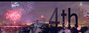 Tªo ®en Tªo ®en - I think this is one of the signatures that stood out the most for me, I just love the blending...it works really nicely, smooth indeed. I also like the top running border, nice to see things less conventional in SOTW  One extra star for you sir |
|
|
|
Post by Knighty on Jul 16, 2007 17:46:00 GMT
SOTW #152Wow, as my first week as SOTW Mod, you all really impressed me. There are some excellent signatures this week and overall, it’s probably the best week I’ve ever seen quality wise. I’d like for more people to enter, but you know what they say, quality over quantity I found ranking these signatures really hard, it was a close race to the top, but in the end, one signature really shined. Thanks for entering everyone, and I hope you had fun competing! Honorable Mentions (In no order):Lust: Decent signature, could use some improvements though. The inward beveled text and font doesn’t really fit and the picture of Master Chief is a tad too blurry. I’d suggest looking up blending techniques, so you can blend photos without the need to make them blurry. The assigned stock is barely visible, but I like the background, it’s very abstract and original. Also, the border seems to be covered up by Master Chief, so remember, never merge until your completely ready to stroke , but aside from the border being covered, the border looks good and fits the color scheme of the signature. Jon Utah: Wonderful siggy, it has a very nice mood and the opaque bar was a great choice. I found this signature a little boring though, there’s no real focal point and the text doesn’t really pop or grab your attention. Also, the blending around the mountains looks a little choppy in places. The text matches nicely, but I think it would look better without the drop shadow, at least in my opinion. Overall, a great siggy, but not perfect, and perfect is what is required to win this week *thumbs up*. White.Night:Decent signature, the render on the side is cool and the chosen color scheme matches the provided stocks mood somewhat. But, there’s no real focal point or anything to draw your eye to it, and it seems a little empty. Also, I’d suggest using more then one color for your composition. Try to find two colors that match and use both to add some variety and spice it up a little. Overall, a little bland, but I’m looking forward to seeing more submissions from you in the future . Cloudblazer:Very nice signature, the blending is great and the color scheme is wonderful. Also, there is a good focal point, which is very important in artistic compositions. But, not the best use of the stocks and there could have been a border, but overall, this is a very solid signature, well done. <Dishwasher Safe>:Lovely signature, great use of the provided stocks and the brushwork on the side looks great. Also, the text is arranged perfectly, the fonts are nicely chosen and the colors match great. The only thing was that this signature didn’t really stick out and despite being a wonderful signature, others were more creative and had more work put into them. Tony: This signature has a great mood to it and the filter that was used to make it darker was well chosen. I’d only wished to see more done to the image and perhaps something exciting. The text and border are great though, both fit perfectly. Overall, a nice and moody signature, but in a week with such a high bar, it didn’t quite make it high enough *giggle*. I’m looking forward ranking your signatures in the future . Mondo66:I really love this signature to be honest with you. It has a great feel to it, like your actually standing at a rock show. The lines keep your eye moving and the band acts as a great focal point. But, the border looks a little funky, try to stick to just a plain matte, so that it doesn’t distract. I would really like to put this as a runner-up, but there are already two of them. So, you get the honorable second runner-up (or third, depending on how you look at it). Infinity:Man, I love this signiture, it has such a great sense of mystery and adventure. The tiger stock is perfect and the eyes really draw you in. But, the blending isn’t the greatest around the top of the head and just looks a little funky. Also, the text that says HIDE is a little hard to see, I had to get a few inches away from the screen to see it. I like the idea of the HIDE text to be hidden, but if it’s too hidden, nobody is going to see it . I would have loved to make this a runner-up, but there are already two… so you get the honorable position of second runner-up ^_^ (Or third, depending on how you look at it). Please come back next week and enter, I really like your work. Runner-ups (Yes, there are two this week):TJ: This is a very, very nice signature, the puzzle idea is executed perfectly and the puzzle pieces are beveled nicely. The layout is flawless and I really like how you decided to grayscale the missing piece, but it might have been better to grayscale the rest of the puzzle and color the missing piece (just my opinion). I’m not sure about the text though, I not sure if I like it or not. It might have been better to reposition it better, but with the length of the text, that might have been a little hard. Also, great use of the stocks, you get the award for “best use of the provided stocks”. Overall, this signature looks like there was a lot of work put into it, it is a very solid signature, you should be proud . Matt:  This is by far one of the coolest signatures I’ve ever seen, the eye is blended perfectly and looks like it belongs…in a non-belonging kind of way. Great use of the provided stocks, and you found the perfect flower to edit the eyeball onto. The text fits in an odd way, the erased background looks actually pretty sexy, and the text placement within it is great. This signature is a great example of a photo manipulation and is executed perfectly, bravo. My only main gripe is that the signature is a little too “washed out” in some places, which draws your attention away from the main focal point (the eyeball). This signature was sooooo close to winning…  So, after much deliberation……………. The Winner:Tao Ren:Ooo la la, this is a great siggy! Very professional looking and the pixilation effect around the edges is great! I love the placement of the text and the model is really hawt . This signature just flows together so nicely and its composition is great. The girl fits in perfectly with the flowers and the lightning on her makes her blend in, while still providing a focal point. Also, the faded effect on the flowers and sky is wonderful. This signature and Matt’s were in close running for the win, but after many hours of deliberation, I decided on this one because of the pure beauty and professionalism of it. 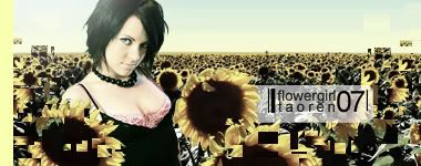 Here's your star: Well, congrats to Tao Ren for a repeat victory, and I'm looking forward to seeing you all back next week for SOTW #153!
|
|
|
|
Post by Knighty on Jul 24, 2007 20:12:29 GMT
 SOTW #153 SOTW #153Ah, a tough theme! Would have liked to have seen more entries, but I guess it was a very demanding theme. I liked the entries though, despite the amount of hate towards the theme, there were actually some great entries. Enough babble from me, on to the judging! Honorable Mentions (in no order):XxSaInTsxX:Nice siggy, very good emotion and I can kind of see where the theme fits in, not quite how I would have interpreted it, so that's great. But, it's a pretty simple signature, just a stock with a filter and some text. You've gotta put something else on it, dude. The stock is great though.... Lamaenic:I really love the idea, but it wasn't executed quite as nice as I would've liked. It's a little boring for me, and I'm not quite sure if the scratch marks was really a great choice, they kind of steal your attention away from the subject. Also, the random anime character at the bottom doesn't fit at all, perhaps, if he was blended or opaque? Another thing, the size of this siggy is a little awkward, try going for something with a little more width, a near square signature doesn't really work... PS, please don't edit your submissions in the future, I let it slide this time because it's so close to when you entered, but it's against the rules sadly. If you have a problem with your submission, please send me a private message and I'll change it.Sissorelle: Lovely signature, but it doesn't quite fit the theme. Also, nothing really catches my eye and draws me to it. Don't get me wrong, this is a great siggy, but it doesn't match the theme enough to warrant a win. Next time, try to incorporate a focal point and the theme and I'm sure it'll be a sexy siggy. TJ: I like this sig, but it doesn't quite show the theme well enough. I can see what you were trying to achieve, but it didn't quite work. The blending is great and the render in the background fits nicely with the stock image. I like this style of art though, and I look forward to seeing your submission next week. Tªo ®en:Nice submission like usual, but the theme looks a little tacked on and doesn't really fit the whole siggy. I really like your style though, props. Nothing really to suggest, just try to utilize the theme a bit better. Infinity:Lovely signature! I really like the minimalism to it and the use of message of it. It just seems like it could have been laid out a little better, the right side just seems so empty... I'd like to award this signature the coveted 3rd place ribbon . Great job. Runner-up:Dishwasher Safe:  This is a great signature! I really love your style, and this siggy reaffirms my love. I have a few gripes though... first, "designs" is spelled extremely wrong, it might be intentional, but doesn't really add anything to the piece, it only detracts. Also, the theme isn't used as well as I would have liked, I can see a few others ways that it could have been used. Don't get me wrong, it's a great sig, but the few downfalls put it just slightly below this weeks winner... Speaking of winner... This weeks winner is...Aussie: Very nice sig, Aussie! I really like the use of the theme, and how it gradually fades into sketching. The stock image fits perfectly and I love how the horn is sketched in. My only suggestion is that the left side is kind of blurry, maybe a blending problem? Also, the colors match great, but it seems a little dull though... And last but not least, the text is not the greatest, perhaps put a little more work into it next time? Well, congrats to Aussie on his first win! He gets a star and a place on the winner wall! XD (Unless he changed his name to Aussie, then in that case, he'd better send me a PM) Sorry for taking a little longer then I would have liked, but the new Harry Potter book took all my time. |
|
|
|
Post by Knighty on Jul 30, 2007 22:53:15 GMT
 Lots of submissions this week, which is great. Also, there are plenty of new faces, and I hope to see all you new folk back next week to give the ol’ SOTW a whirl again. This week’s theme was Cartoons and there were a number of great sigs. Enough chatter, lets get to the results. Honorable Mentions: (in no order)Luster:Interesting sig, but it do with some improvements. For instance, the stock blending isn’t the greatest, and instead of just making the image opaque, you could use some blending techniques that are easily found by searching Google. Also, the border is a little funky, finish your sig and then merge and stroke, so you get a nice even and same-colored border. I do like the use of the calligraphy though, it really matches the overall feel to the sig. Commendable effort Mr. Luster ;D. Rinai Jade KenshinI really like this idea, it reminds me of those old arcade fighting games. The background colors complement spidey and superman and the blending of these stocks is OK. It might have looked better with a border and being a little bigger, as the bottom looks like it just cuts off too soon. The text sticks out a little too much, but it’s decent. Nice use of the theme though ;D. LPFYeah, another premade sig, nice . It’s a great sig without a doubt, but it doesn’t quite fit in with the theme and it just seems a little plain, text wouldn’t have hurt. Overall, great sig, but not quite right for the theme. Next week, I’m hoping to see an Adam (not Aaron ) original. nosferatuFirst off, welcome to SSD! Glad to see so many new faces around the SOTW. This is a very interesting siggy! The animation is actually pretty cool and not a lot of people use animation in their siggies anymore. It seems a little too busy for my tastes and there isn’t really a focal point to draw in eyes. Also, the colors don’t really match, so when your laying out your design in the future, pick a color scheme and try to keep everything within the color scheme. This sig sticks to the theme, which is great, but it could use some improvement. Come back next week! ;D Sasuke I really like the background, it’s something fresh and icey . The anime character fits in well with the background, the flowey-ness of him and the flowey-ness of the background. The text isn’t the greatest, and the two little pink dots distract more then anything. Overall, try to spruce up your text a little bit and add some excitement to the image and you’ve got yourself a good siggy. Jon UtahPokemon…hmm.. I love the background and the text is decent, but the pokemon stock has a slight blue glow, which doesn’t look the greatest. This seems blurry in places, but there is a great focal point, which is really important. Buuuut, Nothing really jumped out at me from this submission, but it’s still good nonetheless. AoiWelcome to SSD and SOTW, glad to have you here. I like this siggy, the background is interesting an the stock is blended decently. I’m not so keen on the color scheme though, it seems little boring. Also, the repeat image on the right doesn’t really add anything, but it’s still unique. I might have tried a black border, as the white border just leaves it with an unfinished look. I’m looking forward to seeing more of your work in future SOTWs ;D. SissorelleThis siggy is way too dark, I can’t even tell what it’s about and I have a very bright monitor. I do however, like how it fades to black on both sides, it creates a real ominous atmosphere. The text is barely readable and seems a little out of place. Perhaps something a bit lighter next time? ;D I do like the white flame-like graphic at the top, it provides a focal point and saves the siggy from being completely dark. blankaLovely sig. Another new face as well, welcome to SSD! I really like the blending (in places), the text placement, the effect above the text and the background. But, it also suffers the fate of most siggies this week, it’s just a little boring and normal. Also, the blending around Captain Americas shield is much too blurry and really sticks out. The color scheme is OK, but some lighter turquoises wouldn’t have hurt. Be sure to enter next week! jackmehoffInteresting name…but welcome to SSD nonetheless! This siggy is bit too blurry and seems a little rushed. The stock is OK, but it’s not the most interesting thing I’ve ever seen. The effect in the top left seems a little out of place as well. Perhaps look up photoshop tutorials and try out some of the cool effects it is capable of (assuming you used Photoshop). Give it another go next week for sure! war4426Lovely signature! Everything blends together nicely, the text is almost perfect and the render in the background fits nicely. A border might have looked nicely, and I’m not so sure about the yellow glow effect around the “XMEN” text. Great siggy, it just didn’t have enough creativity or power to win. This one was this close *holds up fingers really close together* to becoming a runner-up. Oh…and welcome to SSD and SOTW! CloudblazerI like the comic book feel and the coloring effects, but there’s nothing really unique to this. Just looks like a few stocks thrown together and a filter placed overtop. Maybe something more creative next week Mr. Blazer? ;D TJI like the effect and the sense of speed to the character. Also, this is a pretty unique technique, I’ve never seen it before atleast. But, the major downfall of this piece is the text, it’s a bit too disorganized and doesn’t really fit. Also, the black edges are almost begging for some sort of something (heheh) aztec1989I love the text, but the image is just a little plain and boring for me. I would have liked some color in the background perhaps. Nice relation to the theme as well. Runner-upsVictor Lovely sig, but it just didn’t have the creativity to win. Perhaps some text and some diverse colors? Not much to say, it’s a great piece. OracleNice minimalist piece, but minimalist has a limit. This one just seems too bare and not very exciting. But, it has a great focal point and colors. Also, there’s not much to say here, keep up the great work! And this weeks winner…is…..Infinity Nice and simple, and eye pleasing. Great siggy Mr. Infinity! The text spacing and effect could have been better, but nothing is perfect. ;D Congrats to Infinity on his first SOTW win! + +Honor Best of luck to everyone next week! |
|
|
|
Post by Knighty on Aug 7, 2007 3:48:03 GMT
 This weeks theme was nature. I was moderately impressed, there were some good sigs and some OK sigs . Honorable Mentions (In no order):Cloudblazer:I love the feeling and the mood of this sig, along with the color scheme. But, it just seems a little tame and un-exciting. Maybe some text? War4426:Very creative and original, but the black and white just isn't doing it for me. The text at the bottom left doesn't look good at all, and a border wouldn't have hurt. The text fits with the theme, but it just seems a little plain in comparison to the background. SilverWingsGlad to have you back at SOTW . This sig is just too plain for me  . Perhaps some coloring, a effect or two, or some text? If you don't have Photoshop, just ignore what I've said, it's great for just a environment render . LPF:Don't quite see how this relates to nature, can't really see much natural stuff other then the leaf (maybe) on the far left. It's an alright sig, just a little busy and unrelated to the theme. aztec1989:I love the right half of this sig, it has a great filter, great color sheme and those opaque boxes (Don't know the term) somehow fit with the nature theme. The left half on the other hand, the text that says "NaturE" really ruins this piece, the black text in the middle really steals the viewers eyes away and doesn't match at all. Overall, lovely half a sig . jackmehoff:Just a little plain, man. Looks just like a few stock photos to me. The lightning bolt does provide a focal point, which is super, but there's not much going on besides that :\. Unleashed Madness:Sorry, a tad boring . The text doesn't really fit, it might have looked better just straight up and down on the left side. The stock photo isn't all that great (manip wise, it's a great picture), so you didn't have much to work with. MMN: ~epic-:-century~:The text hogs too much of this, and the stock photo isn't that special. I do like the effect on the text, it's really earthy and natural looking. Gray:I don't really like the reflected photo look and the white boxes behind the flowers really distract. Text placement isn't that great, and everything just seems stretched. It looks like a lovely photo though ;D. TJ:This is probally my favorite of the honorable mentions, it has a great vibe to it and the colors really remind me of surf shops I've gone to in the past. I think a bigger white border may have looked better though. ?¿~*¥Lamaenic¥*~¿?Decent sig for being GIMP-made. The stock photo in the back is super boring and the black line really messes things up. The lady anime character fits with the water theme and the blue box below her is nice. The text really ruins this though, perhaps you should look up some text tutorials to get a start? Best of luck Infinity:I love the idea behind this, and I like your pokemon sprite style. But, this one just seems a little lacking. Not really loving the text either . Can't wait to see your next sig . mondo66:This one is OK, doesn't really relate to the nature theme, but the blending is superb. The text is also formatted perfectly and matches great. Runner-ups:jafro: This sig would have totally won if you would have chosen not to include the army character on the bridge. The army guy just ruins the peaceful quality and takes one's eye away from the sigs true beuty. The water effect is awesome and really made this sig stand out. Props, I'm really looking forward to seeing more of your work (no army people though ). Tao-Ren: I've come to expect nothing but the best from you, and you've done it again. Great sig, and great text placement. This was extremely close to winning ;D. You have a very distinguished style, and I love it. Oliver: Lovely signiture, boss. I'm not so keen on the smear lines in some places, but in other places is looks great. The text is OK, the lines below it doesn't really fit. But, the colors are great, the stock photo is great and the overall composition was great. This came very close to winning as well. Hope you enter again next week Ollie . And this weeks winner...Victor: This is a great sig. I love the buildings in the background, it provides a real message without even using text. The colors are great and the style is awesome. I love it! ;D Well, congrats to Mr. Victor, he gets a second star . I hope to see you all back next week for more fun and excitement! |
|
|
|
Post by Knighty on Aug 14, 2007 16:32:06 GMT
SOTW #156[/u] Theme: Ripped from the Headlines Not a lot of entries, but I guess it was a somewhat tough theme. Let's get to it. Honorable Mentions:[/u] Matix:Just an alright sig, kind of boring, but it fits the theme great. I love the picture of OJ, it's classic, but the quality of the pictures are kind of wierd . Jafro:The text is great, it fits with the newspaper type feel and it matches the background great. But, the blending on the two people really throws everything off. Also, there are two competing focal points (both of the figures) which creates for an odd composition. Rinai Jade KenshinNot your strongest entry. The inverted color effect really just doesn't work. The whole thing just looks messy and conflicting. Try a color scheme next time, as colors can really make or break a piece. gray929I like the ghost-like feel to this, but nothing really jumps out at me. It sure does look better on black though ;D. I can tell that you were going for something newspaper-y for the text, but it just ended up a little hard to see and messy. Not a bad sig by all means, just not the best this week. Go Fly Girl/* Sō nansu */While I like the idea of the iPhone as being headlines (much better then that depressing stuff), this sig just didn't do it for me :\. I would have liked to have seen a representation of how apple creates and advertises it's stuff, simple and sleek. The text doesn't look great, a simple white text might have worked better, but the iPhones on the left provide somewhat of a focal point, which is great. Nice job. kellyI love this siggy, it's very creative and the masks and erasing works great. The text is fitted perfectly on the right, and matches the overall feel to the peice. But, the guitar just ruins it for me. The stroke around it is all rough and the guitar doesn't really fit in my opinion. Looking forward to your next submission! Runner-ups:Aztec: Oh man, I love this. It fits with the theme excellently and has a great flow to it. Definately deserves the runner-up position, as it was extremely close to winning. Keep up the great work. Tao-Ren: Great sig, another nearly perfect creation from you. Very hot picture and great message, but it just lacked the feel of our winner. Maybe next week Tao . And our winner...[/u] Project #22329! I love the feel and colors in this sig. It doesn't fit the theme perfectly, but that is about it's only downfall. Keep up the great work, dude. Congrats to Project, he gets a 4th star! Hope to see you all back this week!
|
|
|
|
Post by Knighty on Aug 21, 2007 1:08:40 GMT
SOTW #157This week's theme was Love, and there were quite a few good entries. The week started out slow, but in the end we got a fair amount of entries. Good job . Ok, time to get down to business... Honorable Mentions[/u] ?¿~*¥Lamaenic¥*~¿?A very meaningful sig, I know how it feels . The stock doesn't fit in at all though, and the sig just doesn't seem to fit together. The text is great though, I love the first letters, nice job. Champloo.This sig doesn't really fit the theme that well, atleast in my opinion, and just seems a little simple. The colors are great though and the stock blending is perfect, also there is a good focal point. Keep up the great work . RezistikI like how you interpreted the theme, it's very original. The colors are spot on and the green moon stands out just enough to attract your eye. Very nice. SilverWingsGreat representation of love! A little bit simplistic though, some text might have fit well and the size just seems a little squarish for a siggy. Nice work. CloudblazerNice attempt, I can definately see your style in this piece, which is great. But, everything just blends together and there's not very much subject to look at. This would have maybe been a great background, but not a complete sig . victor. I really love music too and I really like how you used the theme. Most entries interpreted love as between two people, but you twisted it a different way. I really like the stock too, except for his right arm just looks a little wierd. Great sig as usual . Runner-ups[/u] jafro Lovely sig, really brings out mood of love. My only gripe is that the silhouettes looks a little blurry and stick out from the background a little too much. Actually I have two gripes, the right side border looks a little funky aswell, but that's just getting picky. Tªo ®en Another great image... I'm just not so sure about the text or some of the hand-drawn stuff in the background, the left side looks great, but the right side looks a little out of place. I also like how you used the theme, nice job. And our winner....Infinity: Great job here, this sig just screams classic love, and the colors really give you a warm and fuzzy feeling inside . My only gripe is that the text seems a little cut off by the border, and a little big, atleast in my opinion. Overall, my favorite sig this week. Nice job. Well, congrats to Infinity on another win, next week's theme is "Continue the Sig" as voted by you, so be sure to enter! Thanks for all the entries this week though.
|
|
|
|
Post by Knighty on Aug 28, 2007 1:07:46 GMT
SOTW #158This week's theme was "Continue the Sig", as voted by you. Not a lot of entries, but I suppose it was a rather difficult theme. Honorable Mentions:Cloudblazer:I like the text, it fits in very nicely, but the effect on the right just seems to start so abruptly, and there isn't really anything special going on. jafro:I love the message and the text. Very nice use of the provided image and this signature seems well thought out. But, this signature just didn't catch my eye as much as the others did. Solid entry though. Jon Utah:The pokemon sprite just doesn't really fit in and it just seems somewhat out of place. The text is decent, but there's nothing really groundbreaking. But, at least this is very creative and not what I thought would happen to that stock . lparker:Yes, your entry will fit the criteria . I really adore the modern-art feel to the right side and everything just seems to fit together, even though it doesn't seem like it should. The "censorship is..." text was left hanging and the background/foreground effect seems a bit too blurry. Overall, an exceptionally creative piece . vezeta:This signature just seems like it has a little too much going on. The text is fairly confusing to look at too... I do like the effects in the background though, they look great and blend great as well. Thanks for entering! ;D Runner-up: jafro: jafro:I love the message and the text. Very nice use of the provided image and this signature seems well thought out. But, this signature just didn't catch my eye as much as the winner's did. Very solid entry though, I love it. And this week's winner...[/u][/size] Deko: Hah, I love the message behind this one (whether intended or not), that music stems from alcohol (the cord being an amp cord), and that music leads to alcohol, which is extremely true in many cases. I really love the minimalism and the straight-to-the-point message. My only gripe is that the font doesn't really fit in perfectly, and seems a little large/distracting. This is Deko's first SOTW win, so he'll recieve the official SOTW winner's banner in the mail (as soon as I can track down the .psd again), and he gets a star! (Oh, incase you don't wish to waste those precious signature characters on lengthy urls for the star, just type [ star ] without the spaces and you'll have yourself a star  +[star] Well, another SOTW Week gone by... Hope to see you all back next week for another exciting edition.
|
|
|
|
Post by Knighty on Sept 4, 2007 0:46:17 GMT
SOTW #159This week's theme was "Battle Board Signature Battle", the quest was to design a new signature to represent the Battle Board. This week I am only going to list some of my favorites and the chosen winner, because we received a considerable amount of entries. Honorable Mentions:Mondo66: The vector line effect is awesome, and it really fits with the idea of the Battle Board. But, Leon doesn't really apply to this theme and the text doesn't stick out enough for a advertisement signature (of sorts). The background is awesome though too . Keep up the superb work. vezetaThis is extremely visually stunning, and the render blends with the stock guy perfectly. My big gripe is the text though, it just doesn't pop enough (as the text is rather important in this one). I really like the "widescreen" effect, if you will, it really makes it look like a cinematic shot. TjI like the use of the sprite and the surrounding render, much like vezeta's. The text is very prominent, which is good, but this signature just doesn't scream "Come to the Battle Board!". Nice entry none-the-less. Runner-up:Tªo ®enLovely signature as usual, but it just seems a little too faded to attract much attention. The fist stock is great, but I'm not so keen on the scan-lines in this case. They seem to cover up too much and distract your eye. I love the text though, "Them's fightin' words", that's classic ;D. Nice entry though, one of these days you'll win again ;D. And our winner is...[/u][/size] With the repeat victory.... Deko Great signature dude! The colors are wonderful and have a sort of invitation to them, like the battle board is a friendly place. The simplicity gets the point across without overwhelming, and it really sticks out. My only gripe is that the "board" part of the text could be better, and the white text might look better in a pixel font, but that's just me.
Well, congrats to Deko on his repeat victory, he gets another star and his signature becomes the Official Battle Board Signature (Jon will decide what to do with it now ) +[star] Thanks everyone for entering, and if you feel slighted because you didn't get comments this week, feel free to send me a PM or post in next week's discussion thread and I'll be more then happy to comment you . Have fun at school everyone and don’t forget to stop by the Battle Board to battle and vote! ;D
|
|
|
|
Post by Knighty on Sept 11, 2007 3:23:47 GMT
SOTW #160This week's theme was "Text focal". Another slow start, but in the end there were enough entries for this week to be considered a success. Good job all! On to the judging! TjDecent submission, just seems a little simple and the text isn't really that special or emphasized, which was kind of the point this week ;D. Great entry though and thanks for entering! gray929I like the white overlay box thing on the right and the face inside. The keys in the background is a great stock image aswell. The text just doesn't stand out enough and doesn't really flow with the rest of the signature. Nice entry though. jafroAwesome signature, man. It really has a feel to it and the effect around Method Man's head is sweet. Not so sure about the background on the right, it seems a little repetitive. The text is nice though, which is a big part of this obviously. The reflection fits with the liquid feel and the colors match great. Just, it seems a little underwealming... ;D Thanks for entering! Tªo ®en I love the sci-fi-ness to this sig, something new from you, which is sweet. The text is great and extremely creative. I just cant see it winning a text-focal theme though, it just doesn't pop enough. Thanks for entering Mr. Ren. AussieNice signature, I really like the colors of the stock guy and the blending with the background. Not so sure about the text though . Makes a great avatar though . Commendable signature. ;D Runner-up:Jon Utah Man, this week came down to the top two and I really couldn't decide. In the end, I decided that while the text and overall signature is excellent with this one, the winner just took it a little bit futher with fitting the style to the text. I love this signature though, it's great. ;D And this weeks winnerFor the third week in a row....[/u] Deko! This is a first class signature, it looks like something from a magazine or something! The text and font fits perfectly with the worn down brick background. The text is placed perfectly and the simple SKATE gets the job done. Plus, the colors really make it stand out and truly fit the theme perfectly. Well, that's a three-peat for Mr. Deko, he gets a SOTW Champion Title (You'll need to send a PM to a Gmod or Admin to get this) and another star! + Well, thanks for entering everyone, and see you next week!
|
|
|
|
Post by Knighty on Sept 18, 2007 2:27:04 GMT
SOTW #161This week's theme is Film and Photography. Only five entries this week? wtf? Honorable Mentions:dantelightbox:I love the old black and white poloroid, it just has such a great "old-time" feel to it for some reason. Really a lovely signature, but the text was the main thing that put me off. It seems a little jumbled and un-organized, despite the colors working (for the most part) with the signature. Jon Utah:Not quite the best use of the theme, stock image wise, but the text does help incorporate the image with the theme. The text is OK, it just seems a little boring compared to the excitement of the rest of the signature. Thanks for your entry! Tj:This is from Dead Rising, correct? . Great blending techniques for the stock image, and the stock is very well chosen. I'm not so keen on the black and white, but I guess it fits with the dark overtone that the game provides. Overall, just a little bit of a ho-hum singnature, but thanks for entering none the less! Runner-up:[/u] Deko: Lovely signature, very creatively arranged (something original, yay!) and well thought out (looking atleast). This signature has a great icy feel to it, the colors really go together and the combination of the shape and colors really grabs the eyeball. The cutout of the girls head is pretty rough, and that takes away some value. This was another hard SOTW to call. ]And our winner is...[/u] Obsidian I love the mood that this signature portrays, the desperation and loneliness is overwealming and really makes for a great signature. Everything blends together and the colors match (for the most part, see below ). The text is OK, nothing exceptional, but it certaintly gets the job done. The white hazard sign sticks out a little bit too much when just taking a quick glance though. Overall, wonderful signature, well done and thanks for entering! Well, it's Mr. Obsidian's first SOTW win! Congrats! He gets a star [star] and a mini-banner someday! Thanks everyone for entering and keep the entries coming .
|
|


 ::formeonly::


 One extra star for you sir


 . Perhaps some coloring, a effect or two, or some text? If you don't have Photoshop, just ignore what I've said, it's great for just a environment render