|
|
Post by DBuzzin on Jul 19, 2007 18:40:24 GMT
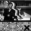
Danny  Tªo ®en  |
|
|
|
Post by .t.w.i.l.i.g.h.t. on Jul 19, 2007 20:19:12 GMT
Sounds good to me... in?
|
|
|
|
Post by DBuzzin on Jul 19, 2007 23:45:15 GMT
yeah well aye sure  |
|
|
|
Post by DBuzzin on Jul 20, 2007 1:46:59 GMT
Haha mine sucks so bad XD
|
|
|
|
Post by .t.w.i.l.i.g.h.t. on Jul 20, 2007 4:08:33 GMT
I really wanted to get one in tonight, but im feeling crappy and I have to go register for classes in the morning... so I will just use this one... |
|
|
|
Post by DBuzzin on Jul 20, 2007 18:43:46 GMT
ahhh fook  you win XD |
|
|
|
Post by DBuzzin on Jul 22, 2007 12:19:04 GMT
come on people, vote |
|
|
|
Post by pandora on Jul 22, 2007 12:49:07 GMT
My vote: Danny
I like both of them for very different reasons. Tao's is interesting. I like the rectangles and squares effect, and it has great color. It makes me think of summer, which is cool.
Danny's is more up my alley, though, to be honest. I like dark. Something about it keeps drawing my eyes. I can compare it to faded denim, in a way, or to an old scratchy black and white film. Nice work.
|
|
|
|
Post by xavier on Jul 22, 2007 18:09:45 GMT
Danny... what were you thinking with that border, if your going to use that sort of border make it 2 or 3px not 5px apart from that though I like it, as pandora said it sort of remindes me of an old scratchy black and white film. Tao I just don't get yours it's a girl in a field of flowers that makes her flower girl? and I don't particularly like the pixelated parts.
My Vote Danny
Danny - 2
Tao Ren - 0
|
|
|
|
Post by .t.w.i.l.i.g.h.t. on Jul 22, 2007 21:29:17 GMT
Damn, Danny should have entered SOTW with that sig, you would have won...
|
|
|
|
Post by Aussie on Jul 22, 2007 21:35:13 GMT
Danny: yours seemed a little bland to me couldve used some constrast and maybe some colors nice job tho'
Tao: I loved this sig the first time i saw it really nice the girl looks right in there it doesnt just look stuck on very nice the squares really set it off and and the textbox lines thingy looks good doesnt spoil it at all
Vote: Tao
|
|
|
|
Post by xavier on Jul 26, 2007 0:43:29 GMT
So now it's Danny - 2 Tao Ren - 1 Keep the votes coming |
|
|
|
Post by Knighty on Jul 26, 2007 4:32:30 GMT
I chose Tao's as winner of SOTW, and will stand behind it again. It's a truly great piece of work. The colors are great, the subject matter is great and the overall professionalism of it is great. Maybe a border would be nice? But other then that, it's flawless Danny, this is a great siggy, but a little dull for me . Like the text and the stock, but a little color never hurt. My vote: Tao
And yes, Danny, you should enter in SOTW ;D |
|
|
|
Post by eagle9 on Jul 27, 2007 0:26:44 GMT
Danny: I really like this, and it looks good with the black border on the top and bottom. Good placement of the text, even though I think a niftier style could have been used to make it stand out more. Overall, good job!
Tao Ren: For some reason, this image never really appealed to me. I think the way you did the sunflowers did not look so good, it might have looked better if you didn't use that effect. Good text placement and style, though. Well done.
Vote: Danny
|
|
|
|
Post by xavier on Jul 29, 2007 16:56:39 GMT
So it's
Danny - 3
Tao Ren - 2
This battle is also still close, more votes?
|
|
♫Matix
Junior Member
 ugh, Weak Sauce.
Posts: 59
|
Post by ♫Matix on Aug 6, 2007 18:05:08 GMT
my vote: TaO
The render of the "Flower Girl" is nicely cut and placed and is blended behind the flowers nicely.
Danny to me is much to contrasted.
|
|
|
|
Post by .t.w.i.l.i.g.h.t. on Aug 7, 2007 5:54:25 GMT
3-3 Now... one more vote.
|
|
|
|
Post by ><Lamaenic>< on Aug 7, 2007 6:40:34 GMT
Gonna have to agree with Knighty on this one, Danny. I love Taos. It is perfect, and the babe is schmexii.
TAOREN FTW BABY!!!!
Edit: Massive text isn't necessary thank you
|
|
|
|
Post by xavier on Aug 7, 2007 21:53:22 GMT
Congratualtions to Tao Ren close battle though.
Final Score
Tao Ren - 4
Danny - 3
|
|


 you win XD