|
|
Post by .t.w.i.l.i.g.h.t. on Jul 23, 2007 18:10:51 GMT
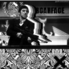
Tªo ®en's Entry: `seventyx7's Entry: `seventyx7's Entry: • Votes: 4
|
|
|
|
Post by TROWLIN' on Jul 23, 2007 18:39:07 GMT
come on at least give better stocks  |
|
|
|
Post by .t.w.i.l.i.g.h.t. on Jul 23, 2007 18:41:24 GMT
Somone wants me to make them a sig, and I figured why not make a battle out of it... and the fist one isnt that bad.
You in?
|
|
|
|
Post by TROWLIN' on Jul 23, 2007 18:51:45 GMT
if i can get something out of the stocks
if anyone gets an entry in before me, i'd face them though, i'm not doing to well inspiration wise lately
|
|
|
|
Post by .t.w.i.l.i.g.h.t. on Jul 23, 2007 18:59:15 GMT
Just a note... I want an entry in today!
|
|
|
|
Post by TROWLIN' on Jul 23, 2007 19:35:49 GMT
|
|
|
|
Post by .t.w.i.l.i.g.h.t. on Jul 23, 2007 20:02:40 GMT
Hmmm... nice. I will have to switch over to my other computer soon and get mine finished. Need to clean my room some first. Parents are riding me about it.
|
|
|
|
Post by mukei on Jul 24, 2007 18:47:29 GMT
Vote: 76
Better depth and clean colors. Tao, the way you blended in the stock, the texture on the stock's face makes it look LQ.
|
|
|
|
Post by Aussie on Jul 25, 2007 0:46:45 GMT
Not much to say really both looked very simple.
My vote goes to 70x7 because it was cleaner nicer, the orange on yours tao looked fair lq with the texture and noise.
My vote: seventyX7
|
|
|
|
Post by xavier on Jul 26, 2007 0:42:00 GMT
I'm guessing LQ means low quality, lazy typers. Tao Ren: Poor colors in comparison to seventyx7's and the texture looks too grainy, nice text though. Seventyx7: Looks like the stocks weren't so bad after all then. It's pretty simple but I like it, I like the light colors especially the light blue. This sig would probably look worse with text so good choice not to have any. Yes like Aussie said they both look simple so there isn't much to say, simplicity isn't always a bad thing though. My vote Seventyx7Seventyx7 - 3 Tao Ren - 0 :votesig: |
|
Infinity
Full Member
 The Eternal Artist
Posts: 109
|
Post by Infinity on Jul 26, 2007 1:50:18 GMT
My vote is seventy. Higher quality. Better effects. Overall looks nicer.
|
|
|
|
Post by Knighty on Jul 26, 2007 4:25:18 GMT
I vote for LPF....but he already won...so poo
|
|
|
|
Post by .t.w.i.l.i.g.h.t. on Jul 26, 2007 5:40:30 GMT
Thanks for rubbin it in Knighty... I will torture the SOTW thread now.
|
|
|
|
Post by Knighty on Jul 26, 2007 17:58:06 GMT
Thanks for rubbin it in Knighty... I will torture the SOTW thread now. You're welcome  |
|