|
|
Post by xavier on Aug 2, 2007 23:12:58 GMT
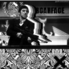
Battle RulesTheme - MUST include a silhouette Size - Large piece at least 400x400 up to 900x900 Programs - any Stock/Render - no unless it's a silhouette Brushes - yes Participants - 2 Due Date - ASAP Votes - voting to 4 Jon Utah: ImageSilverwings: Image
|
|
|
|
Post by silverwings on Aug 3, 2007 0:11:49 GMT
I am in....give me a day? Nevermind, I am done... Image |
|
|
|
Post by xavier on Aug 5, 2007 15:23:51 GMT
That was quick silverwings, I've finished mine aswell ImageLet the voting begin! |
|
|
|
Post by silverwings on Aug 5, 2007 16:19:01 GMT
I was bored. Also I really like yours  |
|
|
|
Post by xavier on Aug 6, 2007 0:20:17 GMT
Thanks I quite like yours too  I forgot to move the thread to voting  *moves to voting* |
|
|
|
Post by ><Lamaenic>< on Aug 6, 2007 17:47:37 GMT
Jon: Yours is fantastic, I love all of the giant polka dots xD It could do without some of the symmetry, but I love it.
Silverwings: Well . . . I don't think there is enough going on in yours. Don't get me wrong, it is great, but it has too little happening.
Vote: Jon Utah
|
|
♫Matix
Junior Member
 ugh, Weak Sauce.
Posts: 59
|
Post by ♫Matix on Aug 6, 2007 18:02:34 GMT
Jon: your use of curves and angels flows well and you didnt leave a ton of empty space around your piece
Silver: Great idea very I guess eligant but I still think you could have had some more going on in the empty space.
My Vote goes to Jon
|
|
|
|
Post by pandora on Aug 8, 2007 2:07:10 GMT
My vote: Jon Utah
Again. I really like the way this one flows. Very smooth. This is a clever piece.
Silver Wings: I thought the font you used for the text was a little uninspired. I also think that the wavy lines should have been more in harmony with the actual dancers. Nice colors for the piece, though.
|
|
|
|
Post by .t.w.i.l.i.g.h.t. on Aug 8, 2007 2:10:24 GMT
Hmm... not super impressed with either... both silhouettes seem a little low quality and not that sharp. Only thing I have for you that fixes that is use the pen tool for silhouettes, its what I do... But, other than that, I think Jon utilized a little better effects in the background, even though quite sparatic, it does add some flow and colors look nice. SW, I just think yours needed some more effects to it, it was quite plain and didnt have much to it. So my vote goes to Jon. |
|
|
|
Post by silverwings on Aug 8, 2007 2:18:56 GMT
That would be 4 for Jon...
|
|
|
|
Post by xavier on Aug 8, 2007 3:09:53 GMT
Jon: Yours is fantastic, I love all of the giant polka dots xD It could do without some of the symmetry, but I love it. My vote: Jon Utah Again. I really like the way this one flows. Very smooth. This is a clever piece. A personal thank you both of you ;D there is still hope for me yet. Good battle Silverwings Final ScoreJon Utah - 4 Silverwings - 0 and a general thank you to everyone who voted! |
|