|
|
Post by xavier on Jul 12, 2007 20:00:39 GMT
Tªo ®en:  Jon Utah:  Voting to 3 |
|
|
|
Post by .t.w.i.l.i.g.h.t. on Jul 12, 2007 20:11:41 GMT
I am down foo...
|
|
|
|
Post by TROWLIN' on Jul 12, 2007 20:12:55 GMT
oooh me me me im rusty  i'll have it in a bit damn you tao! |
|
|
|
Post by Aussie on Jul 13, 2007 0:12:27 GMT
not so busy now if i can still join i'm up for it
|
|
|
|
Post by .t.w.i.l.i.g.h.t. on Jul 13, 2007 3:08:47 GMT
I want this between me and Jonny Boy.
|
|
|
|
Post by Aussie on Jul 13, 2007 3:22:35 GMT
Fair enough good luck both of you!!!!
|
|
|
|
Post by xavier on Jul 13, 2007 3:30:24 GMT
Ok the due date is now the 16th (of July) or before
|
|
|
|
Post by Aussie on Jul 13, 2007 4:01:56 GMT
Ok the due date is now the 16th (of July) or before thats only three days tao will never make that lol  ..................*runs* |
|
|
|
Post by .t.w.i.l.i.g.h.t. on Jul 13, 2007 7:11:09 GMT
OMG!!! I am good... its not even the deadline and I already got it in... my antics have changed fools! |
|
|
|
Post by xavier on Jul 13, 2007 22:37:39 GMT
It's ready for voting already then  |
|
|
|
Post by Aussie on Jul 14, 2007 18:40:57 GMT
ok great sigs both of you!
Tao: Loving this sig blending great awesome effects and brushes were pulled of greatly.
Jon: Again really good sig bg nice, high qulity render but not blended very well also the tango sighted text i cant really read it.......
Vote: Tao reasons a much more detailed sig loads of effects. jon yours is still a great sig but its a bit plain maybe add a few c4d's next time and blend the render better.
Good job to both!
|
|
|
|
Post by eagle9 on Jul 16, 2007 17:40:13 GMT
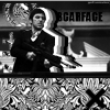
Tao Ren: Again, I really like this image. I think the whole black and white theme looks awesome. The only thing I would suggest is to get rid of the black on the left, I don't think it looks good on this piece. But well done with the text, too!
Jon Utah: I liked this piece as well, but I thought it was a little plain. More work could have certainly been put into it, but it was still good. I think the text style could have been a little better if it was changed.
Vote: Tao Ren
|
|
|
|
Post by .t.w.i.l.i.g.h.t. on Jul 18, 2007 13:27:51 GMT
TR: 2
JU: 0
More votes people! Thanks for the votes above...
|
|
|
|
Post by pandora on Jul 22, 2007 13:08:20 GMT
My vote: Tao Ren
It's not the best one I've seen from you, but it's intriguing none-the-less. It's almost too messy for me, but because it is black and white, it isn't.
Sorry, Jon, but I think the background on this one doesn't go with the soldier at all. I think the man in the sig is too blurred at the edges and blends in with the background too much. The colors are very nice, though.
|
|
|
|
Post by xavier on Jul 22, 2007 17:46:57 GMT
That's that then battle over. Congratualtions to Tao on another win.
Final Score
Tao Ren - 3
Jon utah - 0
|
|


 i'll have it in a bit


 ..................*runs*

