|
|
Post by .t.w.i.l.i.g.h.t. on Apr 27, 2007 16:42:14 GMT
Battle Rules:[/u] « Theme: Use given stock. « Style: Signature « Size: Signature Size « Programs: Any « Brushes: Yes « Stock Photos: Yes« Renders: Yes « Animation: No « Due Date: ASAP « Votes: 4 « Tao Ren's Entry « Schnooble's Entry
|
|
|
|
Post by xavier on Apr 27, 2007 23:20:10 GMT
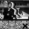
Tao Ren: The same stock but pretty different looks overall. A unique style used on this one it's abstract if that's the right word maybe it's missing a bit of text in one of the corners.
Danny: I probably would of voted for this piece of the colours were different, I don't like the green lines used and the green in some parts. Good border and the text looks good but maybe next time eh.
Vote: Tªo ®en
|
|
|
|
Post by DBuzzin on Apr 28, 2007 0:37:51 GMT
thanks for your comment  I was actually thinking about having the colours different but I was canny tired  Im not to keen on my text |
|
|
|
Post by BªlloFire on Apr 29, 2007 3:56:22 GMT
Tao Ren gmv.
He's has amazing flow, it's clean, the effects executed were done superbly. It all flows really well. I think the pink parts coming up are the pen tool, but it does really add to the flow. It's one of my favorites from your later signatures.
|
|
|
|
Post by .t.w.i.l.i.g.h.t. on May 16, 2007 0:40:51 GMT
Tao Ren: 2
Schnooble: 0
*bump*
Need some more voting people!
|
|
|
|
Post by Admin on May 16, 2007 15:33:57 GMT
My vote goes to Tao Ren
I really like the use of colours here, the pink is a great addition, it contrasts nicely with the gloomy looking background. The one thing I'm not so keen on is the size, I think it could be longer in width.
Schnooble, I think this has a little room for improvement, It would be nice if the details in the background were a lot clearer. Also your text could do with being made a little brighter I think.
I'm going to close this at 3 votes, since it has been open a while.
Tao Ren wins
|
|


 I was actually thinking about having the colours different but I was canny tired
  Im not to keen on my text


