|
|
Post by .t.w.i.l.i.g.h.t. on Apr 5, 2007 19:40:28 GMT
Battle Rules:« Theme: None« Style: Signature « Size: Signature size. « Programs: Any « Brushes: Yes « Stock Photos: Yes « Renders: Yes « Animation: No « Due Date: ASAP « Votes: 4 « Tao Ren « Jon Utah
|
|
|
|
Post by .t.w.i.l.i.g.h.t. on Apr 9, 2007 4:56:59 GMT
No one?
Changed theme.
|
|
|
|
Post by xavier on Apr 9, 2007 6:50:39 GMT
I'll battle you, I'll have my entry in as soon as I can  |
|
|
|
Post by .t.w.i.l.i.g.h.t. on Apr 10, 2007 13:29:54 GMT
Come on Utah.
|
|
|
|
Post by xavier on Apr 10, 2007 16:14:20 GMT
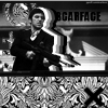
Your telling me to come on? thats rich j/k Here is my entry then. |
|
|
|
Post by xavier on Apr 12, 2007 16:10:02 GMT
Lets have some voting  |
|
|
|
Post by DBuzzin on Apr 13, 2007 12:15:45 GMT
Vote: Tao RenTao Ren: I love this sig, its bright and the use of colour is great. I love the kind of vector look to it and the TR kinda add to the vector look and look awesome  im not sure if it would look better with or without the reapeat overlay thing but its still great love the border
Utah: This is a pretty good shig but im not too keen on it  I dont like the colours and it just looks like you slapped a couple of filters onto a photo. But considering your used to using paint its exellent well done both of you Tao Ren: 1
John Utah: 0
|
|
|
|
Post by Luke on Apr 14, 2007 22:24:39 GMT
Vote: Tao Ren
John Utah, very pixelated, and very washed out. The blending is horrible. Text is below average. This just isn't you're signature bud.
Tao Ren, despite not being a huge supporter of the colors and overall style, you pulled this signature off decently. I don't like the colors and whored paint splashes. And the text could be worked on.
:votesig:
|
|
|
|
Post by xavier on Apr 14, 2007 23:32:10 GMT
Vote: Tao RenJohn Utah, very pixelated, and very washed out. The blending is horrible. Text is below average. This just isn't you're signature bud. Don't beat around the bush Luke, you know say what you really mean. Tao Ren: 2 Jon Utah: 0 I concede, I can tell I'm not going to win and voting is slow at the moment so well done Tao Ren. |
|
|
|
Post by Project #22329 on Apr 15, 2007 5:49:15 GMT
Tao:
+Wild colors and design to fit the stock
+Well chosen stock placement
+Repetition
+Border
-Stock poorly cropped
-Spatter looks blured
-Too much is going on in the bg
Jon:
+For a four people stock :]
+Typo difference by bolding
+Border
-Too much grain
-Colors
-Not much done to the original stock (cropping, blending, brushing)
-Bg is the stock image....
-The font size too large
great job both :]
Vote: Tao
|
|
|
|
Post by xavier on Apr 15, 2007 5:57:19 GMT
Tao: +Wild colors and design to fit the stock +Well chosen stock placement +Repetition +Border -Stock poorly cropped -Spatter looks blured -Too much is going on in the bg Jon: +For a four people stock :] +Typo difference by bolding +Border -Too much grain -Colors -Not much done to the original stock (cropping, blending, brushing) -Bg is the stock image.... -The font size too large great job both :] Vote: Tao*sigh* A pointless vote as I have already conceded, if your going to vote, vote on a battle that actually could do with some more votes. I've got no idea what you mean by 'typo difference by bolding'. |
|
|
|
Post by TROWLIN' on Apr 15, 2007 5:59:54 GMT
"I've got no idea what you mean by 'typo difference by bolding'." text and how it's bolded  |
|
|
|
Post by xavier on Apr 15, 2007 6:04:26 GMT
"I've got no idea what you mean by 'typo difference by bolding'." text and how it's bolded Well if he meant text he could have said it instead of typo difference |
|
|
|
Post by Project #22329 on Apr 15, 2007 6:07:24 GMT
whats wrong with you?
if you lost don't get mad mate, you should get pumped up and practice more...
i didn't do anything wrong...
read through some posts for you will see what you are doing wrong...if three people different people tell you, you're going the wrong way...then there is a big chance that you are going a wrong way, and should turn around eh?
projectdesigns
^ make spacing by changing the typo into bold or different color
btw if you think im trying to put you down or i like tao better or something like this
i havent been here for a long time, so i dont really know you or tao...
|
|
|
|
Post by xavier on Apr 15, 2007 6:14:24 GMT
whats wrong with you? if you lost don't get mad mate, you should get pumped up and practice more... i didn't do anything wrong... Whats wrong is I conceded so I wouldn't get another 4 nil thrashing and Tao has already won so it makes your vote pointless. |
|
|
|
Post by Project #22329 on Apr 15, 2007 6:22:56 GMT
well you're the only one that didn't understand
typo = typography....
text is more of what you written not how it looks
font is only how it looks
typo is overall
in a sense yes
well now you learned what bold is... and typo....you see it's not that pointless
besides, quiting is pointless...
cool down young one...i used to be a mod of battle boards and know that a vote that tells you your weaks and strengths is NOT pointless...
you have a long way to go j, learn to lose, learn to get fired up and inspired, learn to listen and learn to learn :]
you remind me of someone
getting way off topic, i guess if a loss has been admited...
and the winner is tao this can be closed?
|
|
|
|
Post by xavier on Apr 15, 2007 6:29:17 GMT
I'm not mad at you I'm cool I'm calm, I don't like losing but I was excepting it in this one anyway. Remind you of who? |
|
|
|
Post by Project #22329 on Apr 15, 2007 6:35:30 GMT
Not sure, myself when i was starting |
|
|
|
Post by Admin on Apr 15, 2007 12:26:18 GMT
Ok, Tao win's. Jon Utah, nobody likes losing but it seems like you were having a little stab at project there, there's no need, he did give you some pointers afterall I'll close this up now. |
|


 im not sure if it would look better with or without the reapeat overlay thing but its still great
  I dont like the colours and it just looks like you slapped a couple of filters onto a photo. But considering your used to using paint its exellent