Post by Assassinator/Young Everest on Apr 3, 2006 11:36:53 GMT
Well, it's harder work than expected compiling all these results. You may have to wait for the other two catergories, I haven't had time to finish my common ground and elite voting yet and I'm off out in 2 hours.
I wasn't too pleased with the turnout, only 6 people actually entered in this catergory. Here is a list of who didn't enter:
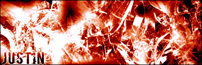
Justin
Lord Spoon
Icehead
Xtran
«©@®м@ñ19»
I'm afraid you won't be able to participate in the next tournament.
Rank: 1
Username: Virtuoso

Assassinator’s Marks
Colours/colors: 7
Originality: 4
Composition: 3
Typography: 4
Overall Aesthetics(is the image visually pleasing?): 6
Border: 6
Use of resources(brushes/images/filters): 7
Total Score: 35
Overall Overview: I thought this image was loud and colourful but a bit on the cramped side. As in the fact that there are three renders in there. Maybe stick to focusing on just the one in the future. I like the fact you have adjusted your colour scheme to fit the renders and that you actually have a range of colours. It gives the piece a bit more variety. There is the matter of the text as well, it’s over the top. I guess because the rest of the signature was so busy that you had to make the text stand out. Maybe this could be improved by having calmer areas of the signature to place text.
Josh’s Marks
Colours/colors: 7
Originality: 6
Composition: 6
Typography: 3
Overall Aesthetics(is the image visually pleasing?): 7
Border: 6
Use of resources(brushes/images/filters): 6
Total Score: 41
Overall Overview: The main thing I felt was wrong with your entry was the text. You can't read the main text, but you can read the sub text more than you should. That should be reversed at the least. I didn't like the way everything was thrown together, though the blending was pretty good. The background was kinda dry to me, but that wasn't the focus of the entry, so very little was taken off for that.
Average Marks(rounded up)
Colours/colors: 7
Originality: 5
Composition: 5
Typography: 4
Overall Aesthetics(is the image visually pleasing?): 7
Border: 6
Use of resources(brushes/images/filters): 7
Total Score: 41
Rank: 2
Username: Chantry

Assassinator’s Marks
Colours/colors: 3
Originality: 7
Composition: 6
Typography: 8
Overall Aesthetics(is the image visually pleasing?): 4
Border: 2
Use of resources(brushes/images/filters): 2
Total mark: 32
Overall Overview: This image to me was quite faded, it lacked boldness and strong colour. You have those coloured hoops in the background, they’re the main part of the signature so really bring them out. Just because a signature is simple doesn’t mean it needs to sit in the background not being noticed. I suggest you don’t use custom shapes in your images due to the fact that that dove is quite well known, it shows more effort if you create your own silhouette.
Josh’s Marks
Colours/colors: 6
Originality: 8
Composition: 7
Typography: 3
Overall Aesthetics(is the image visually pleasing?): 7
Border: 7
Use of resources(brushes/images/filters): 4
Total Score: 42
Overall Overview: I liked what you were going for here. I think your main problem was that you overdid it, big time. I would have gotten rid of the scanlines and make it a little brighter. The low mark on the text was due to the bad colors chosen and the reflection. The message was presented well, though making it darker would have helped.
Average Marks(rounded up)
Colours/colors: 5
Originality: 8
Composition: 7
Typography: 6
Overall Aesthetics(is the image visually pleasing?): 6
Border: 5
Use of resources(brushes/images/filters): 3
Total Score: 40
Rank: 3
Username: .Jake.

Assassinator’s Marks
Colours/colors: 5
Originality: 1
Composition: 2
Typography: 4
Overall Aesthetics(is the image visually pleasing?): 4
Border: 2
Use of resources(brushes/images/filters): 6
Total mark: 24
Overall Overview: When I first looked at this image I first thought loud and over-contrasted. You have bright colours but your blue is too bright and in your face, the patched of white are also too numerous and large. To boost your colour score I suggest you add in some other colours, maybe just some hints of purple or at least some other shades of blue.
Josh’s Marks
Colours/colors: 7
Originality: 6
Composition: 6
Typography:4
Overall Aesthetics(is the image visually pleasing?): 8
Border: 6
Use of resources(brushes/images/filters): 8
Total Score: 45
Overall Overview: I really enjoyed the splash effects in the image. the sub text was very hard to read, and the main text could be a little lighter, perhaps an outer-glow would help. Message gave a good effect, even a somewhat humorous one.
Average Marks(rounded up)
Colours/colors: 6
Originality: 4
Composition: 4
Typography: 4
Overall Aesthetics(is the image visually pleasing?): 6
Border: 4
Use of resources(brushes/images/filters): 7
Total Score: 35
Rank:4
Username: The Tominator

Assassinator’s Marks
Colours/colors: 4
Originality: 5
Composition: 5
Typography: 4
Overall Aesthetics(is the image visually pleasing?): 3
Border: 2
Use of resources(brushes/images/filters): 6
Total mark: 29
Overall Overview: Interesting concept here, although you could of made it more obvious about the whole bird thing. A recurring theme in all these signatures as I go through them is mono-colour; you need to add more tones and colours to your images. Pick a colour theme and build a signature out of that, not just one single colour. I like the text but ‘SSD nationalists’ shouldn’t be in green because of the background although you’ve picked the right colour if you wanted to make it different to the white for another colour in this dominantly green signature just wouldn’t of worked.
Josh’s Marks
Colours/colors: 4
Originality: 4
Composition: 5
Typography: 5
Overall Aesthetics(is the image visually pleasing?): 5
Border: 5
Use of resources(brushes/images/filters): 7
Total Score: 35
Overall Overview: It wasn't very honest on the eyes to be honest. I felt that it looked rushed and lacked any true focal point. The text was somewhat blurry and I think some more colors would have helped immensely.
Average Marks(rounded up)
Colours/colors: 4
Originality: 5
Composition: 5
Typography: 5
Overall Aesthetics(is the image visually pleasing?): 4
Border: 4
Use of resources(brushes/images/filters): 7
Total Score: 34
Rank: 5
Username: jjgrfx
Assassinator’s Marks
Colours/colors: 2
Originality: 2
Composition: 3
Typography: 7
Overall Aesthetics(is the image visually pleasing?): 2
Border: 1
Use of resources(brushes/images/filters): 3
Total mark: 20
Overall Overview: To be quite honest this signature is rather dull due to the fact you’ve used a faded brown. The brushes also semi-hide the render you’ve used there; renders aren’t there to be hidden they’re to be displayed, they’re the main part of signatures if they’re used! The thing I do like about this image(hence I’ve marked you up on it) is the text, it fits in well with the style of the image and is pleasing to the eye.
Josh’s Marks
Colours/colors: 4
Originality: 5
Composition:6
Typography:7
Overall Aesthetics(is the image visually pleasing?): 6
Border: 3
Use of resources(brushes/images/filters): 7
Total Score: 38
Overall Overview: The main thing I found with yours was that it seemed very dull. There isn't a lot of color and the effects do seem to get repetitive, though they are good effects. The border got a low mark due to it being white (at least that is what I think it is) and you can't see it. I think making the stock pretty much all at 100% opacity would have worked pretty well and not erasing any of the text would have looked really good too.
Average Mark’s (rounded up)
Colours/colors: 3
Originality: 4
Composition:5
Typography:7
Overall Aesthetics(is the image visually pleasing?): 4
Border: 2
Use of resources(brushes/images/filters): 5
Total Score: 30
Rank: 6
Username: Eric

Assassinator’s Marks
Colours/colors: 1
Originality: 6
Composition: 5
Typography: 4
Overall Aesthetics(is the image visually pleasing?): 2
Border: 5
Use of resources(brushes/images/filters): 1
Total mark: 24
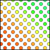
Overall Overview: I know you were going for the simplistic look here but maybe you went overboard with the whole ‘white space thing’. My suggestion would be to add a few coloured lines in the background just to add some interest. I like the interlinking circles but they could be smoother, they’re slightly pixilated. I quite like the text here but I suggest you lower the opacity of the reflection for it’s quite hard to make out the smaller pixel text on top of it at first glance.
Josh’s Marks
Colours/colors: 3
Originality: 3
Composition: 4
Typography:6
Overall Aesthetics(is the image visually pleasing?): 4
Border: 6
Use of resources(brushes/images/filters): 4
Total Score: 30
Overall Overview: The simplicity really didn't really work well here. I think adding some more colors at the bare minimum would really have really helped it out. Also, the sub text is nearly impossible to read.
Average Marks (rounded up)
Colours/colors: 2
Originality: 5
Composition: 5
Typography:5
Overall Aesthetics(is the image visually pleasing?): 3
Border: 6
Use of resources(brushes/images/filters): 3
Total Score: 29
And there you have it. Thank you and well done to all those who participated.
I wasn't too pleased with the turnout, only 6 people actually entered in this catergory. Here is a list of who didn't enter:
Justin
Lord Spoon
Icehead
Xtran
«©@®м@ñ19»
I'm afraid you won't be able to participate in the next tournament.
Novice
Rank: 1
Username: Virtuoso
Assassinator’s Marks
Colours/colors: 7
Originality: 4
Composition: 3
Typography: 4
Overall Aesthetics(is the image visually pleasing?): 6
Border: 6
Use of resources(brushes/images/filters): 7
Total Score: 35
Overall Overview: I thought this image was loud and colourful but a bit on the cramped side. As in the fact that there are three renders in there. Maybe stick to focusing on just the one in the future. I like the fact you have adjusted your colour scheme to fit the renders and that you actually have a range of colours. It gives the piece a bit more variety. There is the matter of the text as well, it’s over the top. I guess because the rest of the signature was so busy that you had to make the text stand out. Maybe this could be improved by having calmer areas of the signature to place text.
Josh’s Marks
Colours/colors: 7
Originality: 6
Composition: 6
Typography: 3
Overall Aesthetics(is the image visually pleasing?): 7
Border: 6
Use of resources(brushes/images/filters): 6
Total Score: 41
Overall Overview: The main thing I felt was wrong with your entry was the text. You can't read the main text, but you can read the sub text more than you should. That should be reversed at the least. I didn't like the way everything was thrown together, though the blending was pretty good. The background was kinda dry to me, but that wasn't the focus of the entry, so very little was taken off for that.
Average Marks(rounded up)
Colours/colors: 7
Originality: 5
Composition: 5
Typography: 4
Overall Aesthetics(is the image visually pleasing?): 7
Border: 6
Use of resources(brushes/images/filters): 7
Total Score: 41
Rank: 2
Username: Chantry
Assassinator’s Marks
Colours/colors: 3
Originality: 7
Composition: 6
Typography: 8
Overall Aesthetics(is the image visually pleasing?): 4
Border: 2
Use of resources(brushes/images/filters): 2
Total mark: 32
Overall Overview: This image to me was quite faded, it lacked boldness and strong colour. You have those coloured hoops in the background, they’re the main part of the signature so really bring them out. Just because a signature is simple doesn’t mean it needs to sit in the background not being noticed. I suggest you don’t use custom shapes in your images due to the fact that that dove is quite well known, it shows more effort if you create your own silhouette.
Josh’s Marks
Colours/colors: 6
Originality: 8
Composition: 7
Typography: 3
Overall Aesthetics(is the image visually pleasing?): 7
Border: 7
Use of resources(brushes/images/filters): 4
Total Score: 42
Overall Overview: I liked what you were going for here. I think your main problem was that you overdid it, big time. I would have gotten rid of the scanlines and make it a little brighter. The low mark on the text was due to the bad colors chosen and the reflection. The message was presented well, though making it darker would have helped.
Average Marks(rounded up)
Colours/colors: 5
Originality: 8
Composition: 7
Typography: 6
Overall Aesthetics(is the image visually pleasing?): 6
Border: 5
Use of resources(brushes/images/filters): 3
Total Score: 40
Rank: 3
Username: .Jake.
Assassinator’s Marks
Colours/colors: 5
Originality: 1
Composition: 2
Typography: 4
Overall Aesthetics(is the image visually pleasing?): 4
Border: 2
Use of resources(brushes/images/filters): 6
Total mark: 24
Overall Overview: When I first looked at this image I first thought loud and over-contrasted. You have bright colours but your blue is too bright and in your face, the patched of white are also too numerous and large. To boost your colour score I suggest you add in some other colours, maybe just some hints of purple or at least some other shades of blue.
Josh’s Marks
Colours/colors: 7
Originality: 6
Composition: 6
Typography:4
Overall Aesthetics(is the image visually pleasing?): 8
Border: 6
Use of resources(brushes/images/filters): 8
Total Score: 45
Overall Overview: I really enjoyed the splash effects in the image. the sub text was very hard to read, and the main text could be a little lighter, perhaps an outer-glow would help. Message gave a good effect, even a somewhat humorous one.
Average Marks(rounded up)
Colours/colors: 6
Originality: 4
Composition: 4
Typography: 4
Overall Aesthetics(is the image visually pleasing?): 6
Border: 4
Use of resources(brushes/images/filters): 7
Total Score: 35
Rank:4
Username: The Tominator
Assassinator’s Marks
Colours/colors: 4
Originality: 5
Composition: 5
Typography: 4
Overall Aesthetics(is the image visually pleasing?): 3
Border: 2
Use of resources(brushes/images/filters): 6
Total mark: 29
Overall Overview: Interesting concept here, although you could of made it more obvious about the whole bird thing. A recurring theme in all these signatures as I go through them is mono-colour; you need to add more tones and colours to your images. Pick a colour theme and build a signature out of that, not just one single colour. I like the text but ‘SSD nationalists’ shouldn’t be in green because of the background although you’ve picked the right colour if you wanted to make it different to the white for another colour in this dominantly green signature just wouldn’t of worked.
Josh’s Marks
Colours/colors: 4
Originality: 4
Composition: 5
Typography: 5
Overall Aesthetics(is the image visually pleasing?): 5
Border: 5
Use of resources(brushes/images/filters): 7
Total Score: 35
Overall Overview: It wasn't very honest on the eyes to be honest. I felt that it looked rushed and lacked any true focal point. The text was somewhat blurry and I think some more colors would have helped immensely.
Average Marks(rounded up)
Colours/colors: 4
Originality: 5
Composition: 5
Typography: 5
Overall Aesthetics(is the image visually pleasing?): 4
Border: 4
Use of resources(brushes/images/filters): 7
Total Score: 34
Rank: 5
Username: jjgrfx
Assassinator’s Marks
Colours/colors: 2
Originality: 2
Composition: 3
Typography: 7
Overall Aesthetics(is the image visually pleasing?): 2
Border: 1
Use of resources(brushes/images/filters): 3
Total mark: 20
Overall Overview: To be quite honest this signature is rather dull due to the fact you’ve used a faded brown. The brushes also semi-hide the render you’ve used there; renders aren’t there to be hidden they’re to be displayed, they’re the main part of signatures if they’re used! The thing I do like about this image(hence I’ve marked you up on it) is the text, it fits in well with the style of the image and is pleasing to the eye.
Josh’s Marks
Colours/colors: 4
Originality: 5
Composition:6
Typography:7
Overall Aesthetics(is the image visually pleasing?): 6
Border: 3
Use of resources(brushes/images/filters): 7
Total Score: 38
Overall Overview: The main thing I found with yours was that it seemed very dull. There isn't a lot of color and the effects do seem to get repetitive, though they are good effects. The border got a low mark due to it being white (at least that is what I think it is) and you can't see it. I think making the stock pretty much all at 100% opacity would have worked pretty well and not erasing any of the text would have looked really good too.
Average Mark’s (rounded up)
Colours/colors: 3
Originality: 4
Composition:5
Typography:7
Overall Aesthetics(is the image visually pleasing?): 4
Border: 2
Use of resources(brushes/images/filters): 5
Total Score: 30
Rank: 6
Username: Eric
Assassinator’s Marks
Colours/colors: 1
Originality: 6
Composition: 5
Typography: 4
Overall Aesthetics(is the image visually pleasing?): 2
Border: 5
Use of resources(brushes/images/filters): 1
Total mark: 24
Overall Overview: I know you were going for the simplistic look here but maybe you went overboard with the whole ‘white space thing’. My suggestion would be to add a few coloured lines in the background just to add some interest. I like the interlinking circles but they could be smoother, they’re slightly pixilated. I quite like the text here but I suggest you lower the opacity of the reflection for it’s quite hard to make out the smaller pixel text on top of it at first glance.
Josh’s Marks
Colours/colors: 3
Originality: 3
Composition: 4
Typography:6
Overall Aesthetics(is the image visually pleasing?): 4
Border: 6
Use of resources(brushes/images/filters): 4
Total Score: 30
Overall Overview: The simplicity really didn't really work well here. I think adding some more colors at the bare minimum would really have really helped it out. Also, the sub text is nearly impossible to read.
Average Marks (rounded up)
Colours/colors: 2
Originality: 5
Composition: 5
Typography:5
Overall Aesthetics(is the image visually pleasing?): 3
Border: 6
Use of resources(brushes/images/filters): 3
Total Score: 29
And there you have it. Thank you and well done to all those who participated.


 Thanks. Eric I honestly thought you'd win. =]