|
|
Post by jongos on Jan 17, 2008 0:39:18 GMT
votes: four jongos:  TR: 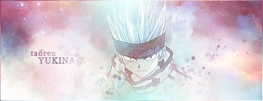 gl, tr. =] |
|
|
|
Post by .t.w.i.l.i.g.h.t. on Jan 17, 2008 5:42:29 GMT
Freestyle signature.
|
|
|
|
Post by jongos on Jan 19, 2008 16:15:41 GMT
Sure, I'll have it by the end of the day.
|
|
|
|
Post by .t.w.i.l.i.g.h.t. on Jan 19, 2008 17:12:43 GMT
Ditto.
|
|
|
|
Post by jongos on Jan 21, 2008 20:38:48 GMT
|
|
|
|
Post by .t.w.i.l.i.g.h.t. on Jan 21, 2008 21:13:15 GMT
They didnt want us doing battles til the new system is up, if after that, I will submit one and what not.
|
|
|
|
Post by jongos on Jan 21, 2008 21:19:05 GMT
i thought it was we weren't allowed to make any new threads, but we could finish those that have already started. and they disabled thread starting in this board so it sort of goes along with my thought, but waiting a week is fine with me.  |
|
|
|
Post by .t.w.i.l.i.g.h.t. on Jan 22, 2008 0:15:41 GMT
Eh... ill have one up shortly.
|
|
|
|
Post by Admin on Jan 22, 2008 5:37:02 GMT
Yea- you guys can go ahead and finish this battle.
|
|
|
|
Post by jongos on Jan 22, 2008 23:48:38 GMT
All right, thanks.
|
|
|
|
Post by .t.w.i.l.i.g.h.t. on Jan 23, 2008 18:15:22 GMT
|
|
|
|
Post by jongos on Jan 24, 2008 22:17:11 GMT
k, good luck. =]
|
|
|
|
Post by SilverWings [Birdie] on Jan 25, 2008 9:12:23 GMT
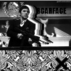
Tao Ren: This like all your work, is very good, I have a growing fondness for your work, it is always attention grabbing but not distracting. While this piece is very bright, it isn't too bright that is pulls away from your excellent stock choice. It just looks a little bit empty to me. Jongos: Like I said to Tao, I have a growing fondness for your work. You are both equally matched in these battles, and both produce excellent work. A bright piece and maybe a little too bright for me. A good stock choice and position. I am not sure how text would look in this, but it might help a little. You both did a good job, but I have to say my vote goes for: Jongos
|
|
|
|
Post by mrsmiley on Jan 25, 2008 19:19:13 GMT
Tao yours isn't up to par. The background is decent, but your render is colored horribly. The color itself is ugly, but the fact that it is mono-colored adds to my dismay. Jongos, pretty good, simple design. Keep it up.
Vote: Obviously, Jongos.
|
|
|
|
Post by jongos on Jan 27, 2008 14:59:22 GMT
thanks people. 2-0 keep voting. |
|
|
|
Post by Ryan on Jan 29, 2008 2:58:55 GMT
There are both very close.
Tao: I liked yours, the stock is cool, but everything seems to be faded. You did a good job with the background, but around the stock it is too bright, it overpowers it. Otherwise you would have won. The text si great, and the diagonal lines add a nice touch.
jongos: I like yours a lot. The metallic feel is carried well throughout the whole image, the little scratches and things work well. The colors are really nice, too! I just wish you had some well placed text!
My vote: jongos.
|
|
|
|
Post by jongos on Jan 31, 2008 0:29:53 GMT
3-0
can this get moved please?
|
|
|
|
Post by .t.w.i.l.i.g.h.t. on Jan 31, 2008 2:21:37 GMT
Call it a battle at 3. Jongos wins.
|
|
|
|
Post by jongos on Feb 1, 2008 14:41:32 GMT
-shrug-
if you say so.
|
|
|
|
Post by jongos on Feb 3, 2008 22:33:36 GMT
lol, it's funny how two of my votes are from a member either banned or deleted.
|
|