|
|
Post by xavier on Jul 19, 2007 22:54:07 GMT
That cookie offer is gone now but the battle is still open for voting  |
|
|
|
Post by pandora on Jul 22, 2007 13:18:47 GMT
My vote: SilverWings
I've always been a sucker for the panoramic sigs. The colors and mood are just brilliant, especially the light beaming behind your name.
Flux, yours is very good as well, and a close second, but lacking something. I'm not quite sure what. Very nice sig.
Ten, yours is good too! Three very excellent sigs. I think I would have liked your sig better if it had a different border, maybe.
|
|
|
|
Post by Akai Shuichi on Jul 22, 2007 13:49:49 GMT
ten: love the choice of colors, they work really well with the sig
Flux: I like this one too, but its a little too dark >_>
SilverWings: your is good, but just looks a little plain
Vote: Ten
|
|
|
|
Post by xavier on Jul 22, 2007 17:50:38 GMT
Thanks for the votes  Ten1387 - 3 Silverwings - 1 flux - 1 Voting to 4 so one more vote could end the battle. |
|
|
|
Post by .t.w.i.l.i.g.h.t. on Jul 23, 2007 18:22:02 GMT
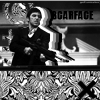
Overall this battle dosent show that much. All signatures I feel show alot of beginer characteristics and deffinately need work. The text in ten1387's completely throws off anything that the sig had, it too large and bold and not placed well. Overall its quite simple sig and somewhat clean but the text really kills it. Text again hurt another one adn that was flux.exe's signature. Here it was the exact opposite, there wasnt enought of the text. It was soo small that it was difficult to read but having the color variation there was nice, also with that sig, the stock had nice blending but seemed to small and centralized other than letting it flow througout the sig more. And last Silverwing's signature. The one thing, and its big, that really brings this one down is the two stocks on the long sig. Its really just not something that looks good. Overall everyone here would need work on thier signatures but I feel that flux.exe had the best one.
Good job.
|
|
|
|
Post by xavier on Jul 29, 2007 16:53:45 GMT
Ten1387 - 3
flux - 2
Silverwings - 1
It's a closer battle than I expected, any more votes?
|
|
|
|
Post by Me on Aug 8, 2007 18:44:11 GMT
Vote: FluxI thought this would just be obvious. However, the voting isn't going this way  . Flux: An awesome signature. The darkness all around the man in the middle really drags you in, and the little details really pulls it together. The positioning is perfect, and the text choice is good. However, the text is a bit blurry, so that could be fixed I suppose. Silverwings: The blending in this signature is what throws it off. The weapon or whatever she is holding on the left stands out way to much. The back ground looks almost vector style (I know it isn't ), so when trying to blend anime into it, it just doesn't work. ten: I really don't like this style. I think the text would look much better with a techy feel to it, rather then just leaving it without anti-aliasing. The hand thing on the left looks pretty cool, but the signature just doesn't flow. A smaller border would be nice too. |
|
|
|
Post by Admin on Aug 12, 2007 21:01:51 GMT
My vote here goes to flux.exe, on the whole it seems the most polished entry of the 3. It could have done with some larger text though.
I thought that ten's was ok but rather messy looking and the text doesn't quite flow here.
SilverWings' entry I thought could have done with a little more work on the background, perhaps some colour going on here too.
|
|
|
|
Post by xavier on Aug 12, 2007 21:28:16 GMT
That's it then Final ScoreFlux - 4 Ten1387 - 3 Silverwings - 1 Congratulations to flux, who isn't around here anymore |
|


 .
.