|
|
Post by gray929 on Jul 16, 2007 0:44:05 GMT
|
|
|
|
Post by .t.w.i.l.i.g.h.t. on Jul 16, 2007 2:26:13 GMT
Oh... dude... yeah. Im down.
|
|
|
|
Post by gray929 on Jul 16, 2007 3:19:12 GMT
Sweet. Anyone else?
|
|
Krazy
New Member

Posts: 13
|
Post by Krazy on Jul 16, 2007 3:35:57 GMT
Me. [=
|
|
|
|
Post by gray929 on Jul 16, 2007 3:44:52 GMT
Ubeness. No more unless you would like die if you didnt enter this battle.
|
|
Krazy
New Member
Posts: 13
|
Post by Krazy on Jul 16, 2007 3:47:18 GMT
Ubeness. No more unless you would like die if you didnt enter this battle. Okay now what is a silhouette? d= Is it like a vector? |
|
|
|
Post by gray929 on Jul 16, 2007 4:28:46 GMT
Go to Images.Google and type it in. It's basically an outline filled in with black. =)
|
|
|
|
Post by .t.w.i.l.i.g.h.t. on Jul 16, 2007 4:44:20 GMT
|
|
|
|
Post by gray929 on Jul 16, 2007 14:06:22 GMT
Exactly ^^^ Nice piece.
|
|
Krazy
New Member
Posts: 13
|
Post by Krazy on Jul 16, 2007 17:54:53 GMT
|
|
|
|
Post by .t.w.i.l.i.g.h.t. on Jul 21, 2007 4:23:05 GMT
Come on Gray... fooL!
|
|
|
|
Post by gray929 on Jul 21, 2007 4:44:12 GMT
Sorry. Just got back today. I lost the psd to my original silhouetee sig that I was going to edit and use in this battle. I might make a new one. I will have it by Sat .
|
|
|
|
Post by .t.w.i.l.i.g.h.t. on Jul 22, 2007 1:23:38 GMT
Hey brah... its satruday!
|
|
|
|
Post by gray929 on Jul 22, 2007 1:27:12 GMT
Whatever  I'll just use this one then.  |
|
|
|
Post by Aussie on Jul 22, 2007 1:50:52 GMT
ok,
tao: lovely piece nice! but it was a bit simple i know its a silhouette battle but it couldve had a few more effects in the background.
Gray: Again a really nice sig but it all blends into each other too much if the silhouette was darkened it would look far better.
Krazy: Awesome piece love the vibrant colors the swirls round the silhouette (i'm stick of typing that word too difficult to spell) look really nice the flare in the bottom really sets the piece off.
Vote: Krazy
|
|
|
|
Post by gray929 on Jul 22, 2007 19:04:01 GMT
0 - 0 - 1
Thanks Aussie.
|
|
|
|
Post by xavier on Jul 26, 2007 14:35:10 GMT
Tao it's a bit too simple for me plus the border is too thick. Gray nice sig, two large pieces and a sig? anyway nice lightness but I think the text and silhouette could do with a being a bit darker. Krazy great piece nice vibrant colors (someone already said that :P) good text and probably the best silhouette choice out of the three.
My vote Krazy
Krazy - 2
Tao Ren - 0
Gray929 - 0
|
|
|
|
Post by pandora on Jul 26, 2007 20:44:53 GMT
My vote: Tao Ren
What can I say? His is just so striking. I love very stark, un-ornamented silhouettes. Somehow, with the sky and your name, this pic just caught my attention. Very clean, very well done.
Gray: Close second. Very close, especially since it is such a muted silhouette. The colors are well done, but I have trouble reading the text.
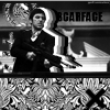
Krazy: This one is decent too, but a little too 80's album cover for my taste. Well done, but not my style.
|
|
|
|
Post by eagle9 on Jul 27, 2007 0:31:21 GMT
Gray929: I really liked the way you put this piece together, it looks awesome! Perfect text style, color, and placement! I don't see anything wrong with this one, except that you could have possibly made the actual silhouette stand out more.
Tao Ren: I liked yours, a lot, but I think it might have been a little too plain. You could have added some more effects to make it stand out more to my eyes, but it was a nice, simple piece at that. I like the idea and nice text.
Krazy: Even though other people liked this one, it did not appeal to me so much. I do think the colors you used were cool, but something is missing. Some more effects could have made it a little better, I think.
Vote: Gray929
|
|
|
|
Post by xavier on Jul 28, 2007 18:33:26 GMT
Thanks for the votes  So at the moment it stands Krazy - 2 Tao Ren - 1 Gray929 - 1 |
|